Reporting is a crucial part of the CRM experience. If you're a rep who needs to understand your pipeline or a leader who needs to track your company's progress toward its goals, it's important that you can surface the insights you need quickly within your CRM tool.
In the past year, Sugar Sell and Sugar Serve have completely reimagined reports, and beginning in April 2023 with Sugar Enterprise on-premises 13.0, this new experience will be available to everyone. Let's look at some of the highlights for viewing reports and metrics in Sugar Sell and Sugar Enterprise. In this post, we'll be focusing on the experience of users (not admins).
In our 12.0 release last April, we started the work to modernize and improve forecasting. In the following releases this year, we continued to make progress by adding pipeline inspection, a key process sales organizations use to build accurate forecasts and optimize outcomes.
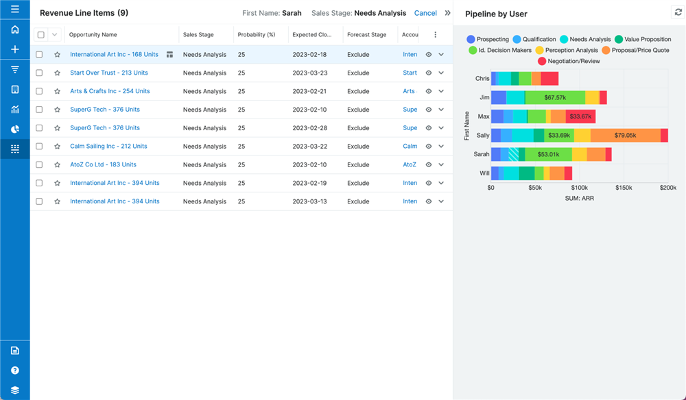
Sales leaders can now run pipeline inspection cadences within the platform and at the Opportunity level, even if they are using Revenue Line Items. A new ribbon of responsive metric tabs automatically calculates the count and sum of deals falling within each pipeline segment, providing a picture of the health and status of the sales period. Clicking each metric tab displays the deals making up that segment, where sellers can drill deeper using focus drawers, take notes, or make live edits. Managers and sellers can also view these metrics for multiple segments of their business by layering ad-hoc or saved filters with just a few clicks.

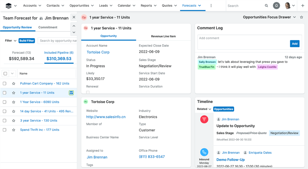
Forecast updates continued through the year and will be available in Sugar 13.0 Enterprise on-premises.
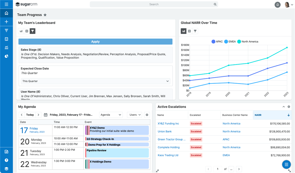
Report Viewer has a new look and feel, with a cleaner, more modern interface with consolidated report actions and options. The new viewer fills the screen with the information you care about while tucking less-used options and actions into familiar menus, including a new ability to quickly visualize all filters in effect without editing a report.
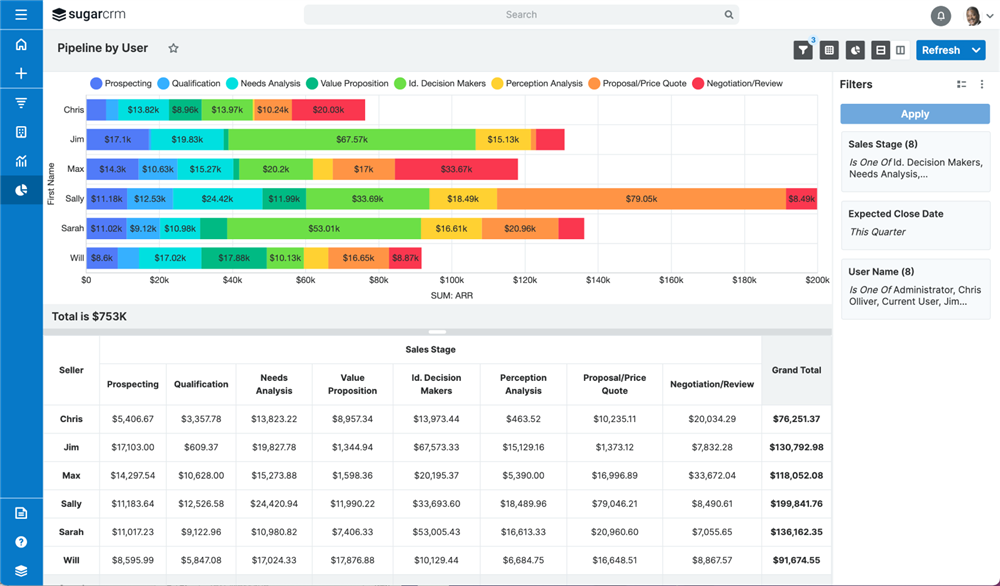
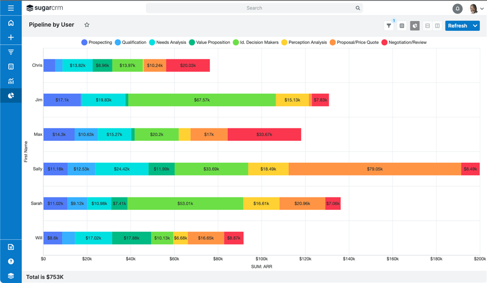
In addition, the user experience has improved with a plethora of new usability options, including toggling on/off charts, data tables, and filters.
For data tables, we've added frozen headers, resizable columns, and optional frozen first columns for Summation reports and Rows & Columns reports.
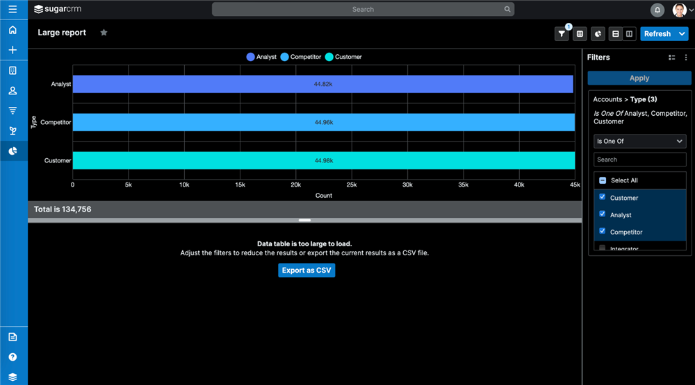
In other usability improvements, Sugar reports are now smarter about handling large result sets and will automatically switch to a simplified, lightweight mode or allow exporting to CSV, giving users the ability to access very large report results.
Scheduling reports has improved as well, with the ability to include charts and embed report results directly in the body of your emails.
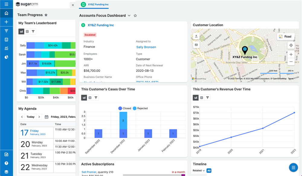
Focus Drawers have undergone many improvements over the past few quarters, and reporting wasn't left behind. Rows and Columns reports now include focus drawers so users can get more details and take action directly from the report. Focus drawers are also available while drilling into any report's chart segments.
Sugar's revamped Report Dashlet provides a context-aware experience as well as tables and runtime filters. Previously known as the "Saved Reports Chart Dashlet," the dashlet's primary purpose is to provide key information at a glance without the need to navigate to the Reports module.
When added to a record or focus drawer dashboard, report dashlets can now be made context-aware, meaning they only show results related to the current record. For example, a case or opportunity report dashlet will only show cases or opportunities related to the account being viewed when the dashlet's "Related to current record" checkbox is enabled.
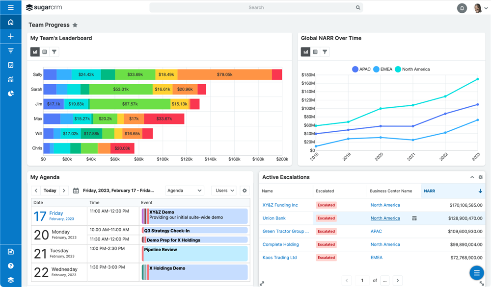
Report Dashlet charts can now be sorted by the charted value, resulting in custom leaderboards that drive performance and leverage gamification.
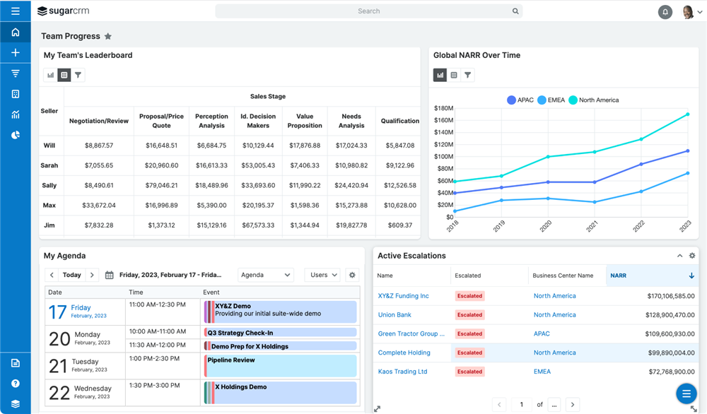
Users can also access greater detail and insight from the dashlet by toggling from the chart to view the data table. Dashlets can be configured to show the table by default or can now be leveraged for reports without charts, allowing complex filtering and data display not previously available to dashboards.
Finally, different result sets can be quickly pulled by adjusting the dashlet's runtime filters without having to navigate to the full report viewer.
As part of our product roadmap, we will continue to build easy-to-consume visualizations for users. Let's look at a couple of recent developments.
First, Sell Premier users can now see how their pipelines have changed over the last seven days using the Forecast Changes dashlet, which responds as you change the team/user and sales period to tailor the visualization for your specific selection.
Recently introduced in 12.3 for Sell Premier, the new Forecast Tracker Visualization provides a single visualization that combines data from multiple modules, allowing users to visually track how their quota, forecast, commitments, and won sales have progressed over the course of the sales period.
Click the links for the latest reporting and forecasting videos.
As you can see, a wealth of new reporting features are available in the latest versions of Sugar Sell & Sugar Enterprise. Upgrade today to get started with the latest and greatest!


