Hello,
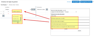
we are probably not the only one to facing the issues with SugarBPM Business Rules screen when you are manipulating dropdown with "long" label.
As you can see on the screen shot bellow, the selected record AND the dropdown element picker are too small ; for some of my customer, this is an important issue because some of the label starts with the same characters so no way to distinguish them easily (need to select one and then using the overlay tooltip to check that the good option was selected)

So, before go further in investigation and probably a quick hack using CSS styling, I just want to know if someone already solves this issue and how ?
Best regards,
Fred
