SugarCRM 13.0 - Reports, Dashlets and Metrics

Hello,

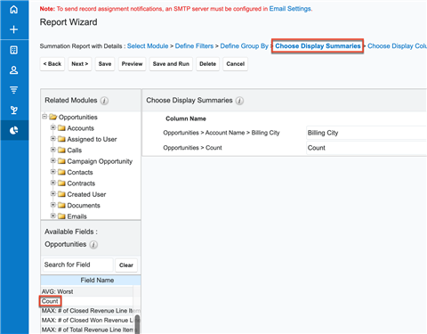
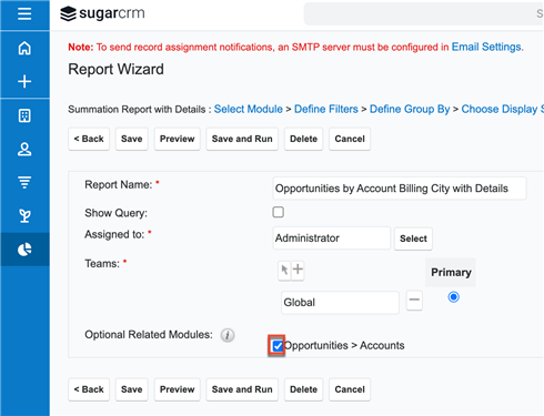
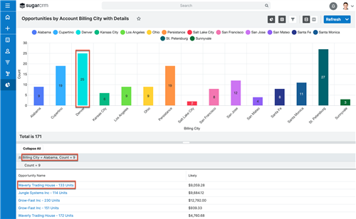
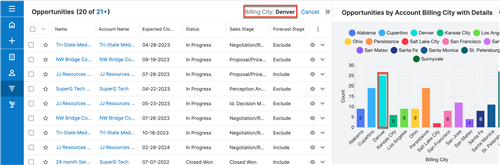
I have a question about new reports / dashlets available in 13.0 Sugar CRM - I've attached a screenshot.

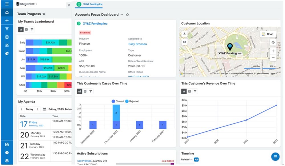
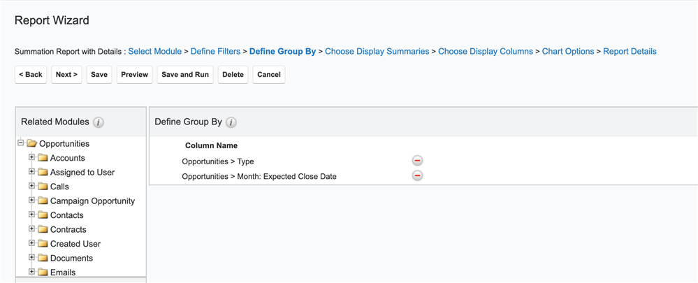
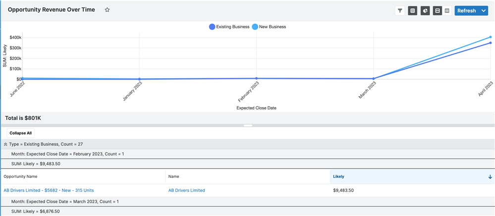
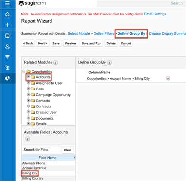
How can I create a "Customer Location" Dashlet and "Customer Revenue Over Time" report/dashlet?

Do you know what other new reports and dashlet metrics are available? I've read the upgrade documentation but could not find any information on the type of reports / graphs that are newly available.

Thank you!
Ada

  • Hi ,

    The 'Customer Location' dashlet is called the 'Maps' dashlet in the list of dashlets to add to a focus drawer or intelligence pane. This dashlet will only be available if you are running Sugar Sell Premier which comes with the Sugar Maps feature. 

    Regarding the 'over time' dashlets in the screenshot, these are dashlets you can achieve by creating a report that groups the data over the desired time intervals (e.g. 'Closed Won' opportunities aggregated by fiscal year) in combination with the 'Report Dashlet' dashlet. When adding the 'Report Dashlet' to a focus drawer or intelligence pane, you have the option to limit the report results to the record in focus so it gives you contextual analytics. 

    Chris

  • Geo Mapping (powered by Sugar Maps) also comes with Sugar Enterprise+ (in addition to Sell Premier, as Chris mentioned) and can be purchased as an add-on to Sugar Serve. You can find more about license types here

    You can learn more about Sugar Maps in the Administration Guide. The Report Dashlet documentation can be found in the Application Guide.

    Lydia Manger

    Product Manager — Sugar Discover

  • Got it & got it - thank you. 

    I went ahead and tried to create the Revenue Over Time report, but I am struggling with adding it to the dashboard in a Line Graph type dalshet form - I am getting an error saying Warning: Line Chart is not compatible with this report". 

    Is this restricted to report types or certain fields? I created Summation with Details report, I added 1 filter (Probability Equals 100, Group by Fiscal Year: Signature Date, and added New ARR (our custom field) as a summary. I am not sure what I am doing wrong?

    Thanks,

    Ada

  • Awesome, thank you Lydia :) With maps - can you also use it to show opportunity split per region / country? 

    Best, 

    Ada

  • Hi ,

    In order to use a line graph type, you need to have at least 2 different group by fields. In my sample report, I used the Opportunities > Type and Opportunities > Month: Expected Close Date (the first group by field is used to graph the separate lines and the second group by field is what will be the X-axis of your line graph):

    That then was able to generate the following line graph:

    A good rule of thumb is that if you cannot select the desired chart format when creating the report, then you won't be able to use that chart format in the report dashlet either. 

    Chris

  • Got it - thank you very much for all your help on that - it is working now. Looks cool!

    Best, 

    Ada

  • Hey

    I think I am doing something incorrectly with the report. I understand that this report call show accumulated ARR over time? 

    In my graph, I can only see the ARR per Fiscal Year, but not the accumulation - am I missing something here?

    Thanks, 

    Ada

  • , I think in order to make the results meaningful, it might make more sense to build a report from the Opportunities module and then choose a "Group by" field of address country/zip code/some type of region field. You certainly could put the Sugar Maps dashlet on the Opportunities list view, for example, but then you might just have a cluttered map with a pin for each opportunity. You could filter your list view by region and that would filter the map, too, but it still seems like that might not be the best way to really dig into the data.

    One way I'd suggest going about it is as follows:

    1. Create a Summation with Details report and select the Opportunities module.
    2. In the Define Group By step, choose the field you want to group your opportunities by. Here I'm choosing the account billing city. 
    3. In the Choose Display Summaries step, I chose to add "Count" so I could see how many opportunities are in each billing city without having to count them myself :) .
    4. In the Choose Display Columns step, I chose to display the Opportunity Name and Likely. 
    5. I chose to display a Vertical Bar (Stacked) chart below, because I want to be able to drill into the segments.
    6. On the Report Details page, I checked the Optional Related Modules checkbox next to Opportunities > Accounts so that if an opportunity doesn't have an account linked, it is still presented. 
    7. Here's my report. You can drill into the opportunity names, see the overview at the top of the sections about the billing city and how many opportunities are there. 
    8. If you click on a bar in the chart, you drill into a drawer that shows the records that comprise that segment! 

    It might be a neat visualization if we had a "map" chart type that could plot the grouped data on a map somehow, but we don't have that. 

    I hope this helps!

    Lydia Manger

    Product Manager — Sugar Discover

  • Hi ,

    There's nothing you are doing wrong per se. I can't think of a way using Sugar's native features that you could build a visual report showing how a customer's lifetime ARR increased over time.

    Chris

  • Hi

    Thanks for the explanation. I thought that the purpose of the line graph was to show the aggregated revenue. 

    Is it possible to do set this up in Advanced Reports? 

    Thanks, 

    Ada

1 2