clustered bar chart instead of stacked

Hi 

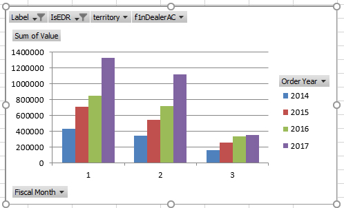
Does anyone know how I can get graphs to mimic excel in this one the Quarters are group

Excel Example

SugarCRM Example

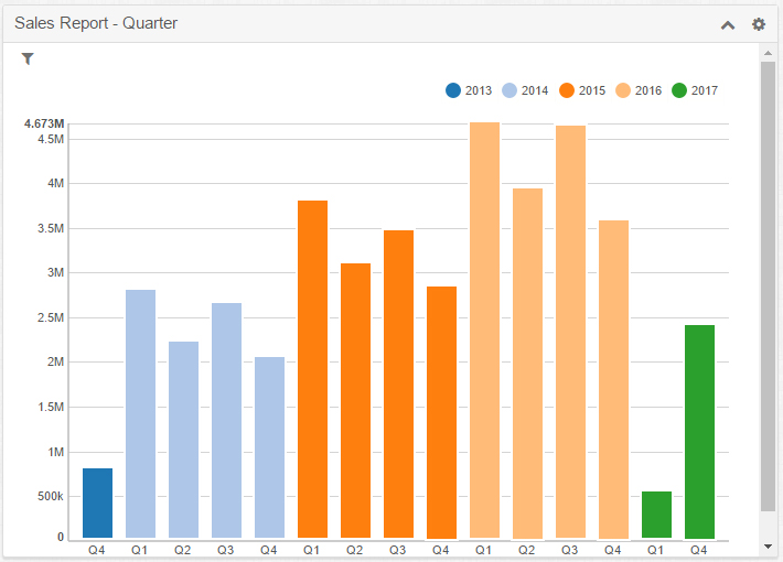
In SugarCRM I group by Quarter/Year and get this if I do Year/Quarter I get a stacked bar chart.  

Is there any way with or without a plugin I can recreate the top image??

Any help much appreciated.

Parents
  • Hi Joe,

    To display the grouped bar chart does require some code changes unfortunately.

    This is a normal stacked bar chart:

    Normal stacked bar chart

    Same chart with "stack" set to false and "showControls" set to true:

    Grouped bar chart

    Those options aren't currently displayed in the Saved Reports Chart dashlet currently but could be implemented by code in a custom package.

    Please let me know if the details would be of interest to you (would require administrative privileges).

    Sincerely,

    Henry Rogers

Reply
  • Hi Joe,

    To display the grouped bar chart does require some code changes unfortunately.

    This is a normal stacked bar chart:

    Normal stacked bar chart

    Same chart with "stack" set to false and "showControls" set to true:

    Grouped bar chart

    Those options aren't currently displayed in the Saved Reports Chart dashlet currently but could be implemented by code in a custom package.

    Please let me know if the details would be of interest to you (would require administrative privileges).

    Sincerely,

    Henry Rogers

Children