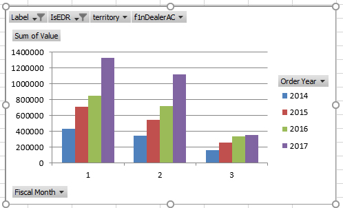
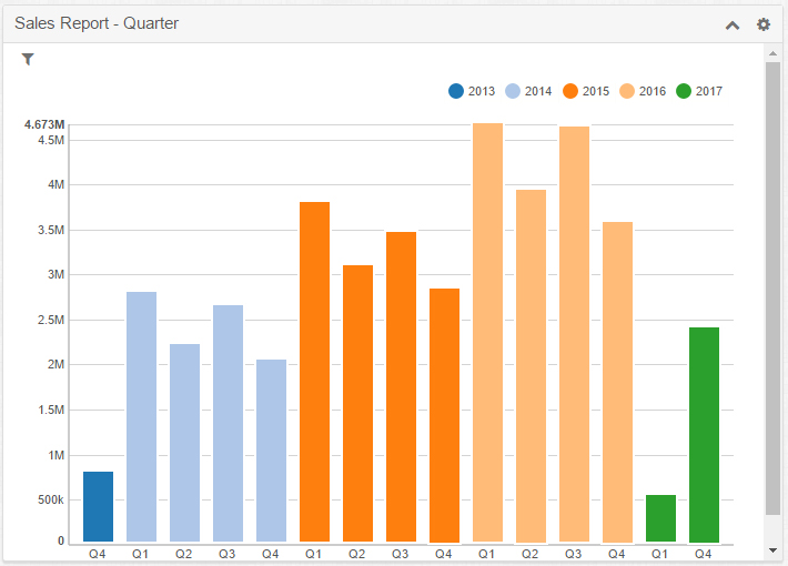
clustered bar chart instead of stacked

Hi 

Does anyone know how I can get graphs to mimic excel in this one the Quarters are group

Excel Example

SugarCRM Example

In SugarCRM I group by Quarter/Year and get this if I do Year/Quarter I get a stacked bar chart.  

Is there any way with or without a plugin I can recreate the top image??

Any help much appreciated.

Parents Reply Children
  • Joe,

    As it sounds like from your last comment, you have seen that the vertical and horizontal bar charts in a saved report chart dashlet have an option in the configuration panel to set the "stacked" attribute. If set to false (or unchecked) it will produce a grouped bar chart.

    Saved report chart dashlet stacked option

    That chart controls can be displayed to the user with a method called "showControls" which if set to true will display the "Grouped" and "Stacked" options next to the legend. I've created a 7.7 compatible loadable package (attached) to expose that option to the user.

    It also cleans up some of the display disparity between the horizontal/vertical "Bar Chart" and "Grouped Bar Chart" chart type options. 

    If I understand your last comment correctly, you would like to have that same option of showing a bar chart with multiple levels of grouped data as "stacked" or "grouped" for the charts in the main Reports module. Is that correct? If so, we would need to modify the Report Criteria Results page to add that option. I can dig into how hard or easy that would be if you haven't already found a solution.

    Henry