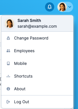
- Dropdown menu styling has been updated to improve their consistency throughout the application. This update applies to two different types of dropdowns:
- Bootstrap dropdowns (elements with the “.
dropdown-menu” class and their descendant list items) - Select2 dropdowns
- Bootstrap dropdowns (elements with the “.
- This update specifies default styling for dropdown menus such as menu background colors, menu border radii, item alignments, item text colors, item paddings, and item hover/active styling.
- It does not affect the logic or content of dropdowns.
- “How does this affect my customizations?”
- Your custom “
.dropdown-menu” and Select2 elements should automatically be updated to the new styling.- If you have not already overridden their styling.
- While in most cases this is likely the desired outcome, if you have any custom components that use these dropdowns, you may want to double-check their styling to ensure they look appropriate and make any changes as necessary
- Your custom “
