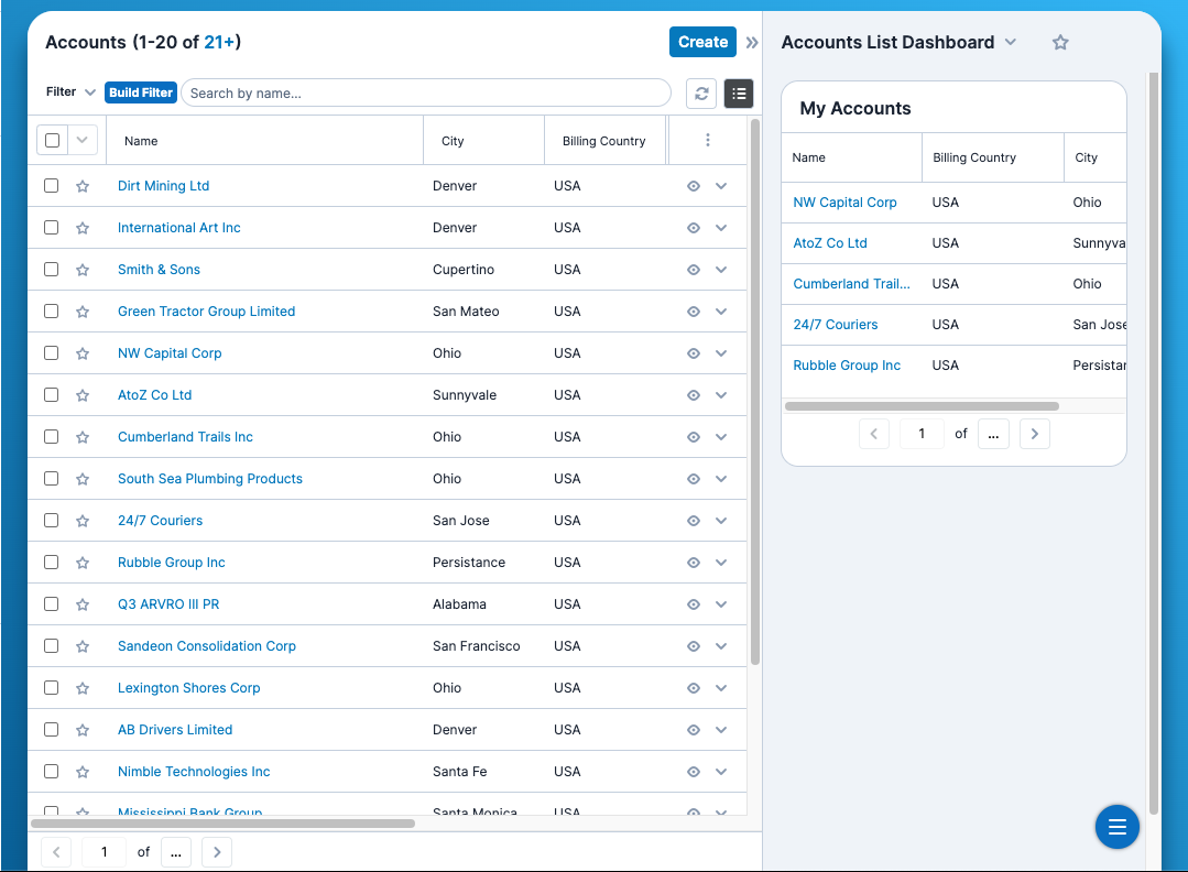
- The size and alignment of the content pane ( <div id=”content”>) element has changed
- The content pane now has a “floating” appearance with a 24px gap added on either side
- The top corners of the content pane are now rounded
- “How does this affect my customizations?”
- Most elements should adjust automatically to fit the updated size and alignment of the content pane.
- However, you will want to be aware of any custom elements that make use of fixed positioning, as their widths or positionings may need to be updated.
- We have defined a few LESS variables that can assist you in any calculations you may need to make to determine the size/alignments of fixed elements in your
custom.lessfile:@mainPaneSideGap(default: 1.5rem)- The gap size on each side of the main pane
@mainPaneTopGap(default: 3.5rem)- The gap size between the top of the viewport and the top of the main pane
