Adjust scale of chart axis?

Is there a way to adjust the scale of the axis of a chart? We have a couple of financial metrics that we report on and we pull the charts into a dashboard for easy reference. However, the scales of the charts being different makes it harder to directly compare the two at a glance.

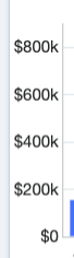
E.g. scale for chart #1

E.g. scale for chart #2

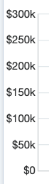
It looks like these are dynamically created according to the values of the data in the chart, but it would be really helpful to be able to adjust these manually to match.

Would appreciate any guidance anybody can give. Thank you!

Parents
  • Hi Lily and sorry for the delay! There is no way to do that out of the box in the UI, unfortunately. I suggest you contact Support and file an idea for us to take a look at! I agree that this would be super useful, especially when looking at reports side by side!

    Lydia Manger

    Product Manager — Sugar Discover

Reply
  • Hi Lily and sorry for the delay! There is no way to do that out of the box in the UI, unfortunately. I suggest you contact Support and file an idea for us to take a look at! I agree that this would be super useful, especially when looking at reports side by side!

    Lydia Manger

    Product Manager — Sugar Discover

Children
No Data