Reports - forecast vs target

Hello,

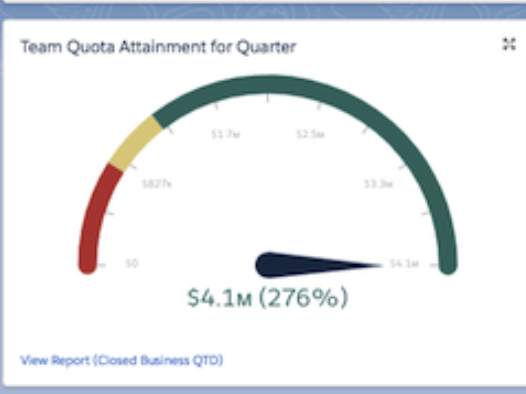
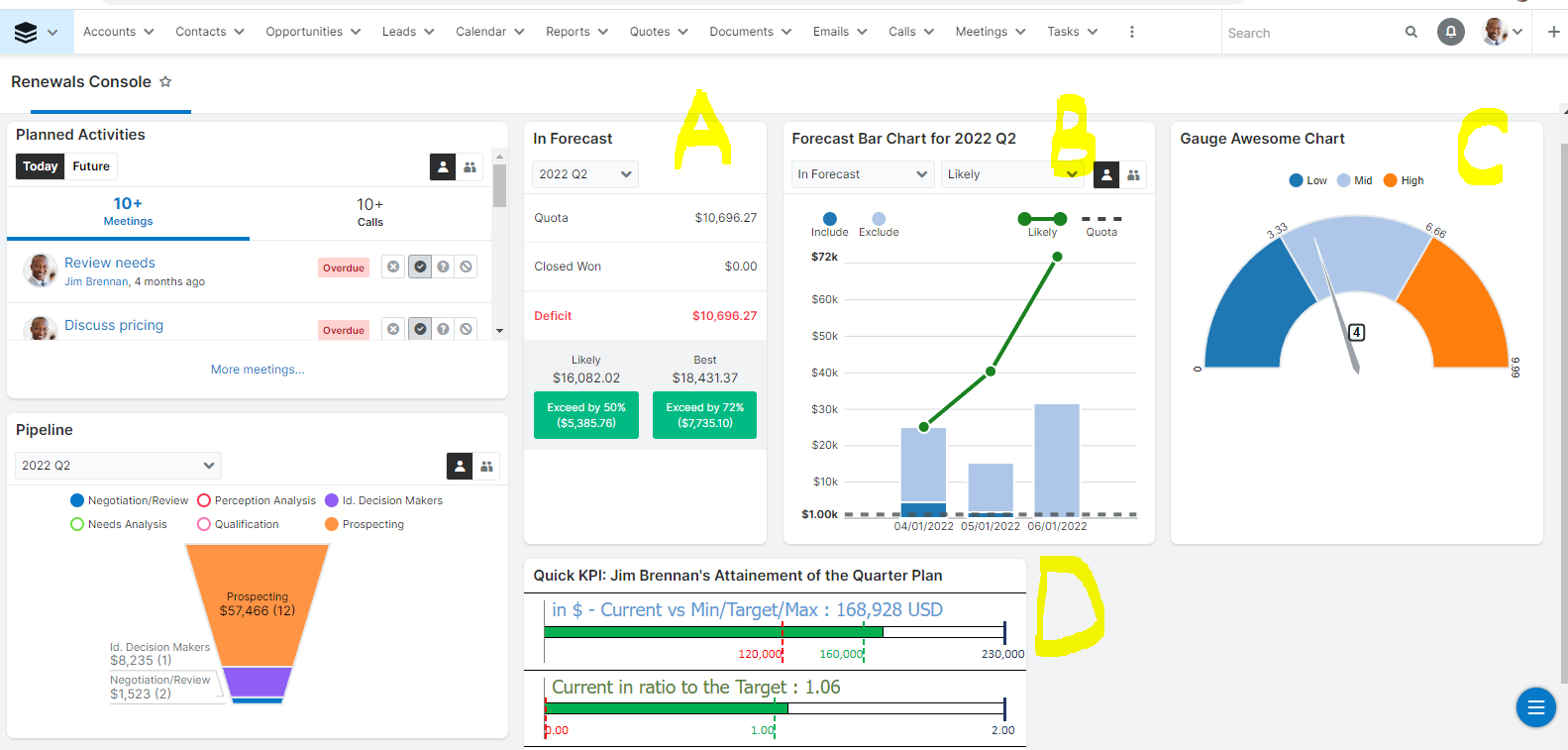
Do you know is it possible to set up targets for dashboards in SugarCRM - e.g. target for Month A is 10,000 USD revenue and the dashlet will show how far we are to reach the target? 

I am looking to set up individual targets as well as group sales targets.

Thank you!

Parents
  • Hey Ada, 

    This question might be better asked with the Sell folks, but I'll try my shot at it.

    Without knowing how, exactly, you have the Forecasts module set up, I wonder if you're aware that in the Forecasts module, someone that has users that report to them may see their reportees forecasts at the user level. You may learn more here:

    https://support.sugarcrm.com/Documentation/Sugar_Versions/12.0/Sell/Application_Guide/Forecasts/index.html#Management_Hierarchy

    This is, however, using the Forecasts which can only be set up Quarterly or Yearly ( https://support.sugarcrm.com/Documentation/Sugar_Versions/12.0/Sell/Administration_Guide/Forecast/ ) So it's not on a monthly basis, but at best, a 3-month basis. Still, this might help you better understand where reportees are at on a user level.

    The two forecast dashlets do not have user-level statistics. You can see the details on those dashlets here:

    https://support.sugarcrm.com/Documentation/Sugar_Versions/12.0/Sell/Application_Guide/Forecasts/index.html#In_Forecast_Dashlet 
    https://support.sugarcrm.com/Documentation/Sugar_Versions/12.0/Sell/Application_Guide/Forecasts/index.html#Forecast_Bar_Chart_Dashlet

    It may make more sense to create a Summation or Summation with details reports on Opportunities or RLIs expected to close in a specific month, and then add the report's chart to a Dashlet. 

    We have some stock reports that may be close to what you are looking for. You can copy these stock reports and modify them to suit your needs, or use them as-is if they work for you:

    Pipeline by User (Revenue Line Items)
    Quotes Created by Users by Month
    Open Quotes by Stage by Close Month
    Open Opportunities by User by Expected Close Month

    You may see more stock reports here:

    https://support.sugarcrm.com/Documentation/Sugar_Versions/12.0/Sell/Application_Guide/Reports/Stock_Reports/

    Hopefully, this at least helps you get closer to what you are looking for. If you have more specific information, please let me know! I'm happy to help however I can. 

    -Raye

  • Hi Raye, 

    That's very useful, thank you. We still need to set up Forecast unfortunately, so I am looking for a interim solution.

    I was thinking about a graph type that you set up one goal for yourself or team and the sum of e.g. ARR appears there against the goal - similar to what Salesforce graph has.

    Is something like that possible to add in Sugar?

    Thank you!

    Ada

  • Hi 

    I've tried to mark 4 dashlets on the screenshot of my Sugar demo instance with yellow letters  A, B, C, and D

    A and B  are out-of-the-box dashlets that visualize Forecast fulfillment  - they could be of great use in case the out-of-the-box Sugar Forecast  functionality outfits your company expectations

    C is a visualization of gauge chart (that's the type of the chart on your screenshot) should be available as a Sugar visual asset, however, the one on the scene is just visualization - delivery of the background logic is a custom work that could be performed by Sugar Prof Services or Sugar Partner teams (like ours) - literally with code development that require programmers efforts

    D is a Quick KPI functionality dashlet that allows setting configurable Report-based criteria for visualizing min/current/target/max values on the dashlet - as Sugar Partner we delivered that enhancement  for one of our customers

    Nevertheless, I'm very interested to know what Sell folks or other consultants would advise on your inquiry to have KPI  visualized on the dashboard  - please share here on a chance

    Best Regards,
    Dmytro Chupylka

    integroscrm.com
    We make work in Sugar CRM system faster, more convenient and efficient

Reply
  • Hi 

    I've tried to mark 4 dashlets on the screenshot of my Sugar demo instance with yellow letters  A, B, C, and D

    A and B  are out-of-the-box dashlets that visualize Forecast fulfillment  - they could be of great use in case the out-of-the-box Sugar Forecast  functionality outfits your company expectations

    C is a visualization of gauge chart (that's the type of the chart on your screenshot) should be available as a Sugar visual asset, however, the one on the scene is just visualization - delivery of the background logic is a custom work that could be performed by Sugar Prof Services or Sugar Partner teams (like ours) - literally with code development that require programmers efforts

    D is a Quick KPI functionality dashlet that allows setting configurable Report-based criteria for visualizing min/current/target/max values on the dashlet - as Sugar Partner we delivered that enhancement  for one of our customers

    Nevertheless, I'm very interested to know what Sell folks or other consultants would advise on your inquiry to have KPI  visualized on the dashboard  - please share here on a chance

    Best Regards,
    Dmytro Chupylka

    integroscrm.com
    We make work in Sugar CRM system faster, more convenient and efficient

Children
No Data