Hello,
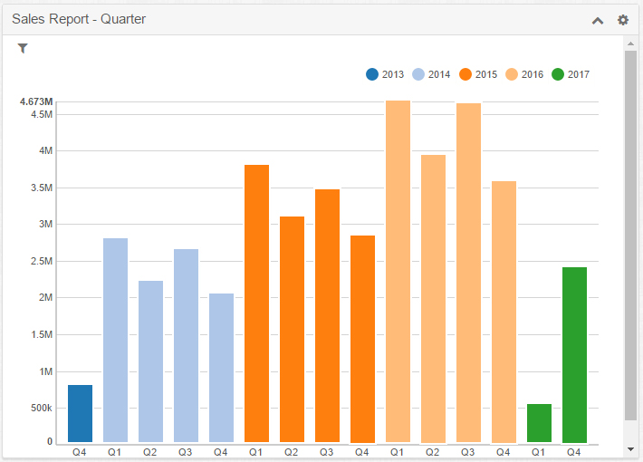
I read Christian Wettre's blog post on "how we use dashboards" (there) and found it interesting. I noticed the charts that are used on the first 2 dashboards:
- There seem to be additional icons in the title bar: image (?), save
- The grouped bar charts seem to be sorted, which AFAIK is not possible with standard reports
- New chart types: area charts, bar charts with targets + attained
Is that a future version? A custom development? An additional plugin? Sugar Discover?
Thanks & happy new year to all!

