Building reports in Sugar will provide you with insights into everything from how well your sales team is performing to better understanding your customers’ needs, all while providing meaningful data points to drive your business decisions. Sales reports help analyze pipeline performance offering precious insights that can be used in one-on-ones and team meetings and data that can be used in leadership meetings and during decision-making processes or forecasting how much revenue your company should expect in the future.
Sugar is all about improving productivity while doubling down on reporting capabilities. Sugar’s Report Dashlet not only empowers you to surface the reports you need efficiently when and where you need them in the application, but its settings also allow you to display your data the way you want to see it. It’s never been easier to:
1. Add your report to a dashboard using Report Dashlet
Reports can be displayed on dashboards via Report Dashlet, enabling you to view a chart and data table, interact with run-time filters (if any), and drill to chats and tables to see the underlying data. You’ll want to start by adding your needed report to a dashboard using the Report Dashlet.
Step 1
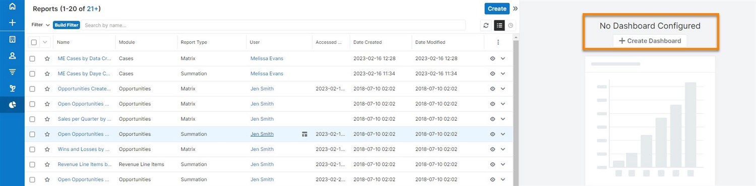
Create a Dashboard (e.g., Sales Dashboard).
Step 2
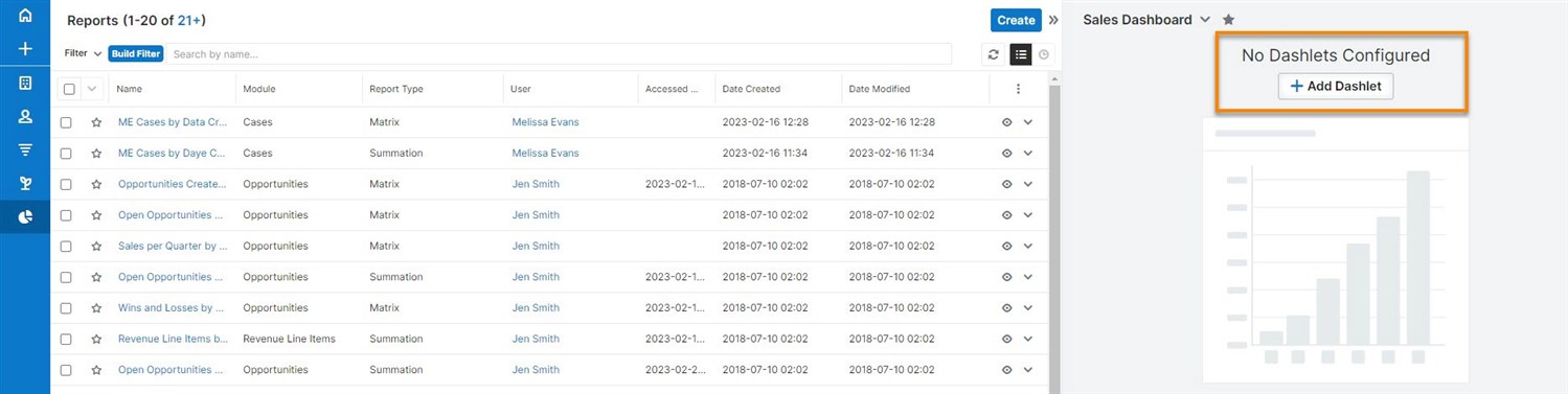
Add a Dashlet.
Step 3
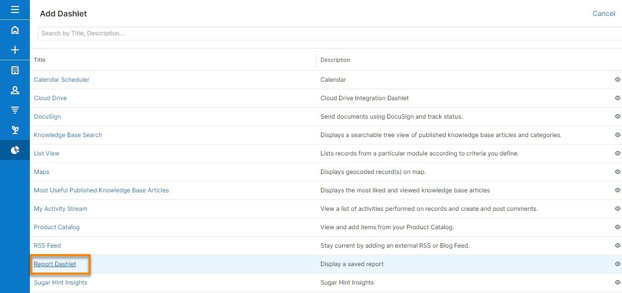
Select Report Dashlet from the list.
Step 4
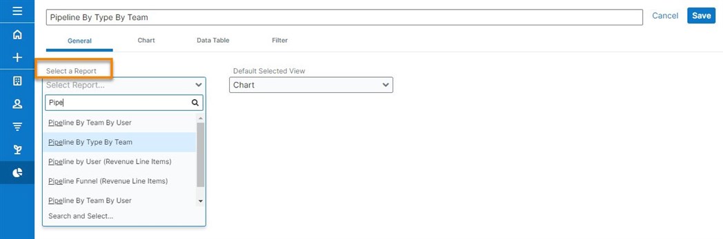
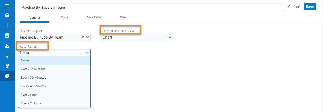
Select and configure your Report Dashlet by searching and selecting the desired report (you can select any report to which you have access).
Step 5
Configuration options allow you to define how the dashlet will display.
Step 6
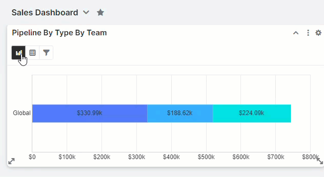
When viewing the report dashlet, use the chart (if available), table, and filter icons in the top left to toggle between the tabs. Any changes you make in these tabs are unique to your dashlet on the current dashboard.
2. Sort chart data the way you want to see it.
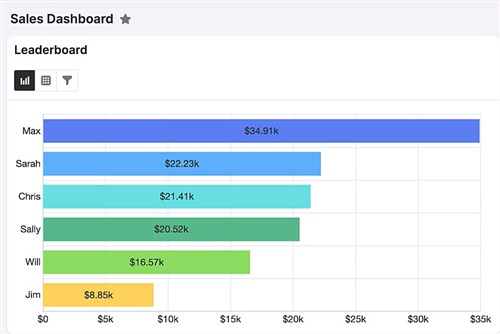
Let’s say you’ve created a report that shows all opportunities won for the current quarter, and you would like to use this report as a leaderboard for your sales team to easily track your top performers. As you’re adding the report to your dashboard, you can select which value the chart will sort by:
Step 1
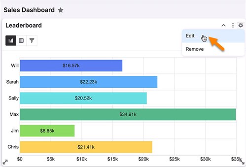
From the Setting menu, choose Edit.
Step 2
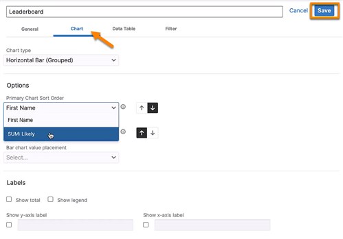
From Chart Options, you chose the SUM: Likely as the primary chart sort order and hit Save.
Step 3
Now you see your top performer first, along with the value.
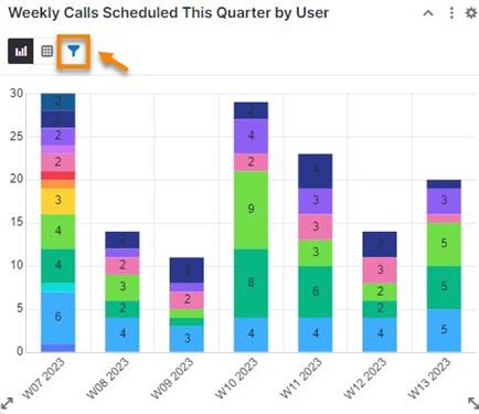
3. Access report details directly in the dashlet
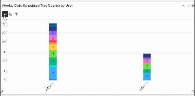
A pipeline dashlet can be easy to size up, but if you want to inspect more details, you may want to change it to a table view. Let’s walk through how you can easily toggle from chart to table:
Step 1
Hover over the table view and click on it.
4. Change your report filters on the fly.
When defining report filters, you can check the Run-time box. This will enable you to change your filters in real-time or tailor your results according to your preferences after you’ve saved and run your report.
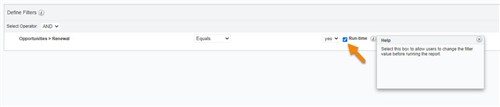
Let’s say you are planning a trip to New York to visit your key customer accounts. You can easily create a report showing the accounts you want to visit in that location. Defining filters by the Account Type (you may plan to visit Customers, Prospects or Partners, or all of them) and location (i.e., the Billing City on their record). You can repurpose the same report to check other locations or account types by making the filters within your report “run-time” filters, All you have to do is change the filter selection according to your new interest.
Now it’s possible to change the filtering option directly in the dashlet. If the Run-time was checked in the Defining Filter process—as described above—you could now make the change in three simple steps.
Step 1
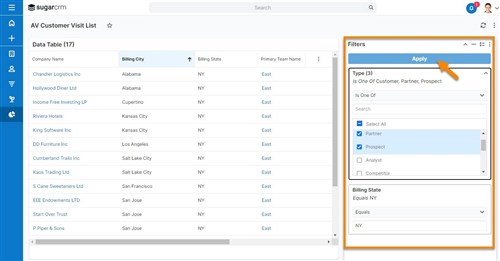
Go to the Filter icon in the Report Dashlet of your choice.
Step 2
Make a new selection, then click Apply.
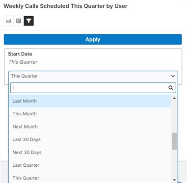
Step 3
The Report Dashlet shows the new results according to your most recent filtering option(s).
Please note that the report name won’t be changed, and neither the original filtering setup. This is just an easy way to see different results of the same report directly in the dashlet.
Final Thoughts
Sugar’s Report Dashlet allows you to surface the data you need, where you need it most, with a few simple clicks. And don’t forget that reporting is for everyone in the organization. As a sales rep, you need reports to stay on top of your key accounts. As a sales manager, you may want to track your team’s performance and focus your coaching efforts on the sellers that need it most. At the executive level, reports help evaluate strategies against business realities. You may want to use reports when negotiating a new deal so your investors see that the business has the potential to pay off.
Interested in learning more about how to use reports, trigger proactive actions, and gain a new level of visibility into the business? Be sure to register for our live-interactive Sugar Reporting class.


-

Heather Hildreth
-
Cancel
-
Vote Up
0
Vote Down
-
-
Sign in to reply
-
More Actions
-
Cancel
Comment-

Heather Hildreth
-
Cancel
-
Vote Up
0
Vote Down
-
-
Sign in to reply
-
More Actions
-
Cancel
Children