The 5.1.0.x release of wMobile Phone for GoldMine includes a modern and clean UI throughout the entire phone application. The look and feel was considerably improved and a lot of new features were added.
When a wMobile user first logs into wMobile Phone after upgrading to wMobile 5.1, they’ll be notified of the User Interface update.

This information can be accessed again from the About link on the user menu for reference.
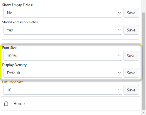
To adapt the display to your mobile device screen size and to your needs, new Font Size and Display Density settings can be used. The Display Density choices are Compact, Default, and Large. You find them in the “User preferences” section.
Home Menu
The new Home menu is cleaner and easier to read. This menu can be customized in the user preferences section. The modern style is set by default with predefined colors to each category.
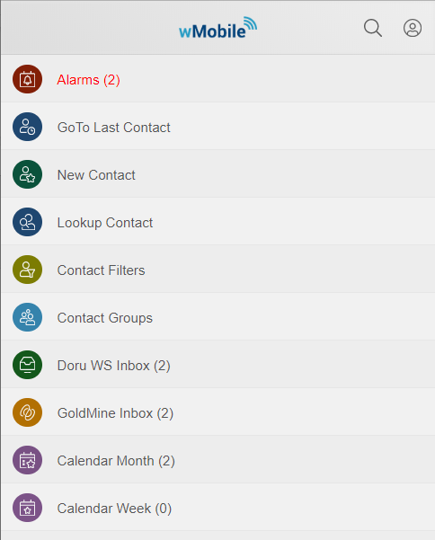
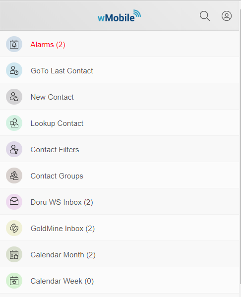
You have the option to generate random colors each time you navigate to the home menu or to change color brightness.
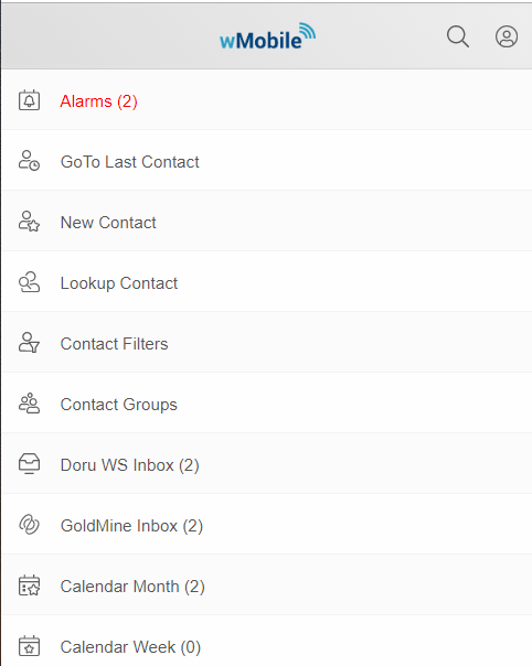
You can switch to the classic menu (no background colors).
Top Bar
A top bar was added which is always available. It contains navigation links (back and home), the title of the current page, search contact button, and user profile menu button.

Quick Search Contacts
Click on the magnifying glass from the header menu.

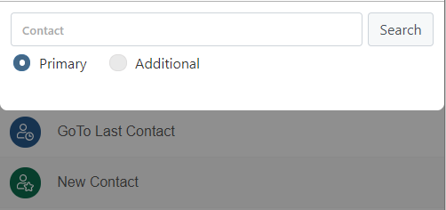
The search contact button will open a popup where you can search for a primary or additional contact.
User Side Menu
The user profile menu button will open a new menu specific to each user.
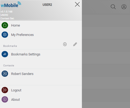
At the top of this menu you will see information like: the logged in user name, the selected contact set, the current application build number.
Then, you will see the following menu items:
- Home page link
- User preferences link
- Bookmarks
- You can save your favorite pages and access them directly from this menu
- Recent Contacts
- You can personalize how many recent contacts to see (from 0 to 10) and in which format. This option is available in “Side menu options”.
- Available formats:
- Contact
- Company
- Contact, Company
- Company, Contact
- Logout option
- About page link
Admins can edit this menu in the Manager Console. They are able to add new items, hide items, or change the item order in the same way it can be done for the Home Menu .
Bookmarks
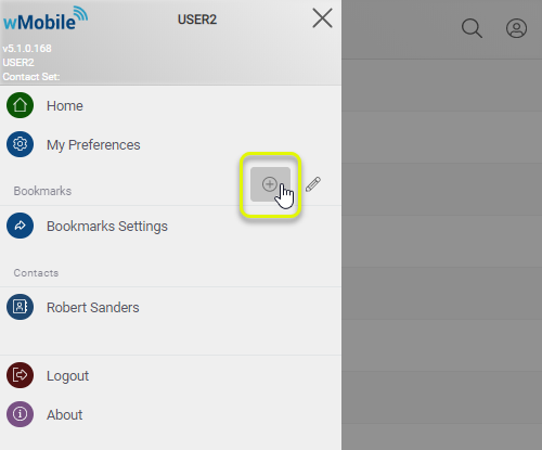
It’s very easy to save a frequently used page. Just navigate to the desired page within wMobilePhone, open the side menu and use the ‘New Bookmark’ (+) button.
You will have the option to set the name of your new bookmark.
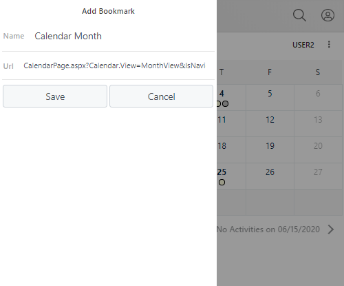
Note: You can change the URL with an external link if you want to access an external web page directly from wMobilePhone.
After the link is saved, it will appear in the Bookmark list.
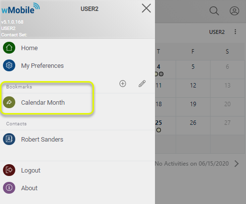
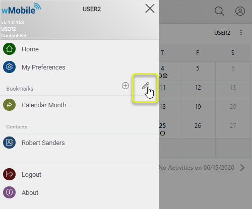
If you click the pencil icon (Edit) you will be redirected to the ‘Side menu options’, where you can edit your bookmarks.
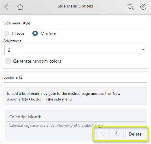
You have the option to edit the bookmark name, to delete bookmarks or to move up/down bookmarks.
Contact View
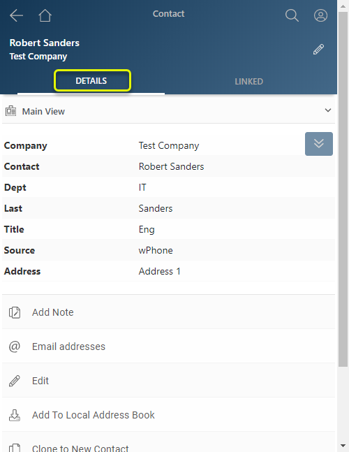
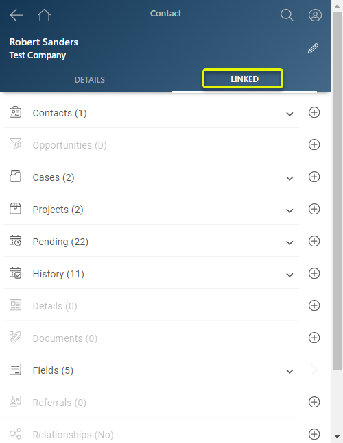
The contact view is separated in two tabs: Details and Linked.
The Details tab includes summary information such as you’d typically see on the top of the GoldMine screen.
The Linked tab shows linked information such as Contacts, Pending, History, Opportunities, etc.
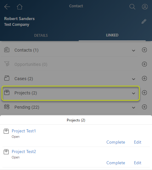
The down arrow will provide a listing of the relevant records:
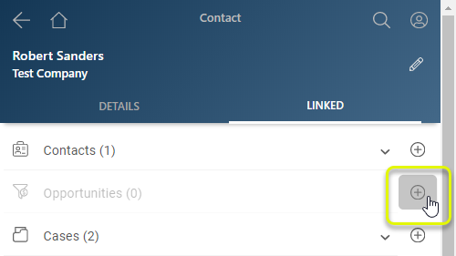
It is very easy to add a new linked item. Look for the desired linked item type and use the corresponding ‘add button’ (+).
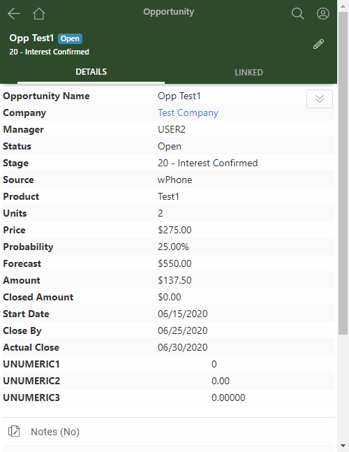
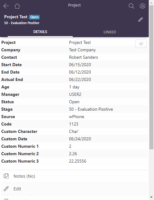
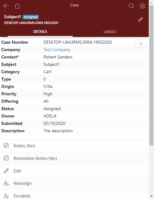
Opportunity view, Project view and Case view will have the same style as Contact view.
Calendar View
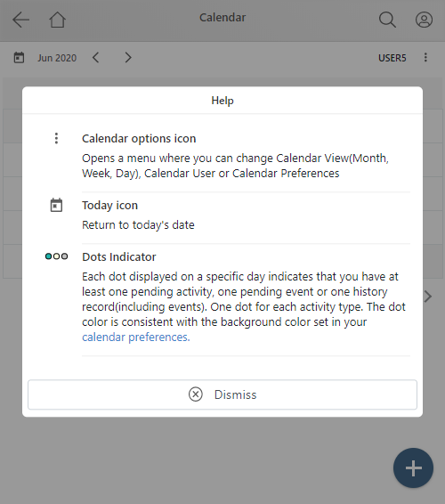
When a user opens the calendar view for the first time, he’ll be notified of changes in the Calendar view:
The updated Month View layout makes it easy to view activities, navigate, add activities.
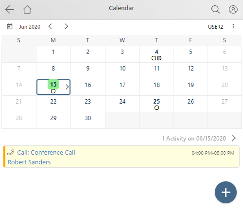
With one click on a specific day, you will see a list of all the activities on that day. Another click will redirect you to the Day View.
The calendar icon in the top left will navigate to today.
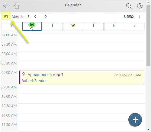
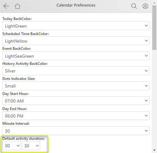
A new setting was added for default activity duration. If you typically schedule activities for 30 minutes, then set the default activity duration for 30 minutes.
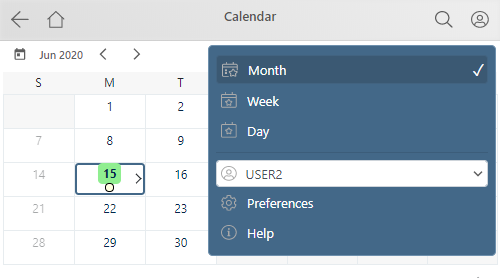
You can switch between views, change the calendar user, or navigate to calendar preferences in the calendar menu:
Email center
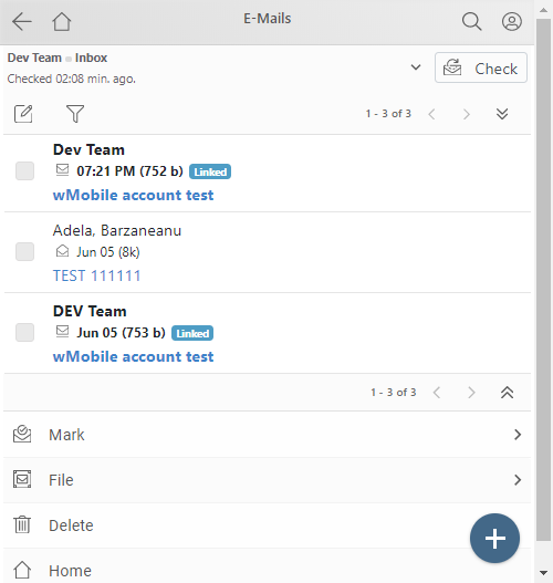
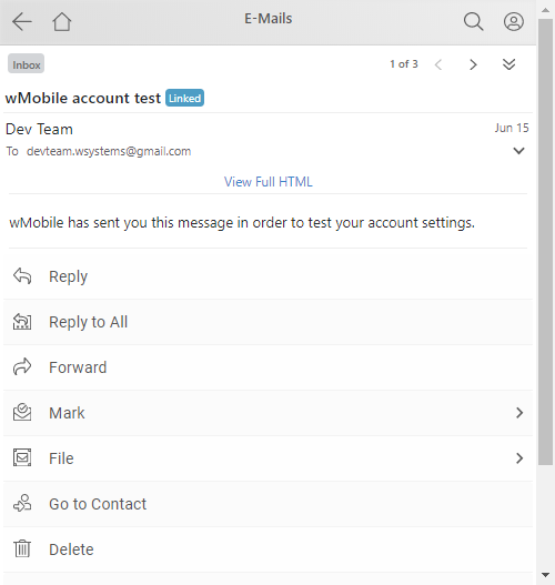
The email center will offer email navigation and email view improvements as well as menu reorganization.
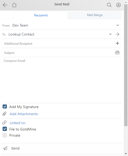
The compose email page is cleaner and easier to use.
List Views
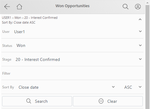
When you navigate to a list view, you will see at the top a description of any active filter.

When expanded, the filter is editable and you can search for new items.
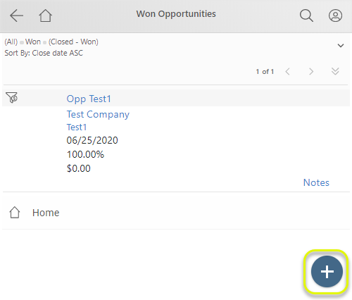
In the bottom right, you always find the new item button.
We hope you enjoy the new layout and functionality!
