
In Fall ‘19 a new feature has been added in wMobile for GoldMine (Desktop): the Metric Dashboards. These metrics dashboards represent interactive data graphs. This information is presented in bar charts, forecast charts, and donuts charts. In this article, we’ll describe the metrics on Opportunities.
Keep track of your Opportunities with these new metrics which help you to analyze and visualize in an easier way the progress of the Opportunity sales on different periods of time.
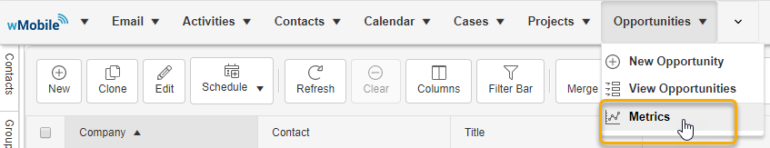
The metrics dashboard can be open from the Opportunities tab -> Metrics:
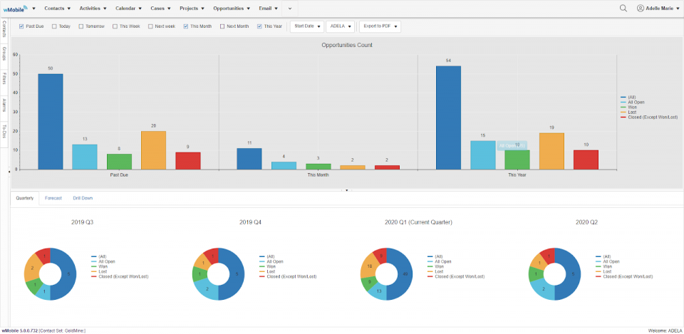
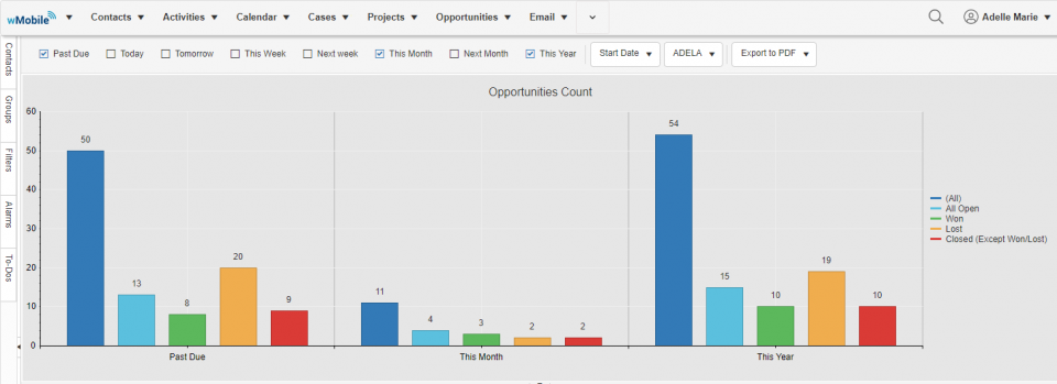
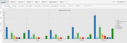
At the top of the Opportunity Count, you can make different selections for choosing what type of opportunities you want to display. It can be filtered by periods of time, ‘Start/Closed Date’ & ‘Close By’ or even to export one of the charts.
By permissions set in GoldMine, you can choose for which user you want to display the opportunities graphs.
In the first area of metrics you can also find:
- The top part of the dashboard represents the opportunities counts
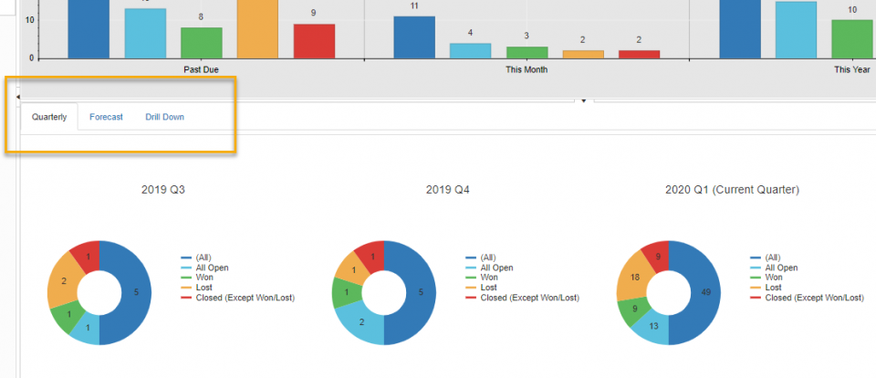
- In the bottom section, there are three tabs which represent different information
- In the ‘Quarterly’ tab, you will find four donut charts that represent 4 periods of time
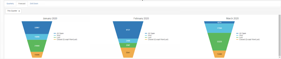
- The ‘Forecast’ tab represents the sum of all types of opportunities. Also, these graphs can be displayed quarterly
- The ‘Drill Down’ tab will be open when a specific type of opportunity is selected. (For example, click on a column from the first chart and in the ‘Drill down’ tab the selected opportunities types will be listed. Select the Charts tab to return to the list view.
The legend of the colors is detailed on the right side. The opportunities types are displayed or hidden by clicking on the specified color. This behavior is applied for all types of graphs, in the Opportunities Count, Quarterly and Forecast tabs.
In the second area, you can see the donut charts which represent 4 time periods of a year. The legend color is also detailed on the right side with the same actions as in the Opportunities count area.
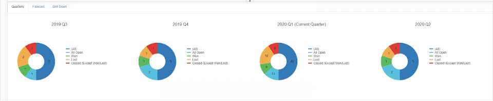
As above, if you want to see the active opportunities, you simply click on the color assigned to this type of opportunity in the chart to drill down. The ‘Drill Down’ tab will be opened.
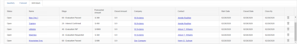
From this tab, you can modify an opportunity, by clicking on its name. It can also be deleted (based on GoldMine permissions). By clicking on the company or contact name the contact page will be open. Click on the Quarterly tab in the top left of the drill-down chart to return to the Chart view.
The ‘Forecast’ tab presents the sales opportunities in monthly graphs, split in 4 quarters. The user can choose the quarter from the drop-down list which is located in the left corner, under the tabs. Like in the ‘Quarterly’ tab, if you want to see a type of opportunity, you click on the assigned color for this type and the ‘Drill Down’ tab will be open.
We hope the Opportunity metric dashboard will help you to have a clear vision of your sales progress, easy access for updating information and make sure no Opportunity gets overlooked.