We've recently posted about our fantastic reporting and analytics capabilities available with Enhanced Forecasting, part of Sugar Sell Premier. Now, we're pulling out all the stops and introducing you to all the available out-of-the-box visualizations, their purpose, and how you can use them within your business.
Consider the following breakdown by visualization function, then see a full description of each visualization's purpose and related use cases by clicking the links.
Here are some reasons why sales pipeline performance is important:
With Enhanced Forecasting, you can see your top performance metrics at a glance. Easily manage your team with individual performance views, or toggle over to see your full pipeline and forecast metrics and how they've changed over time.
This visualization shows the 10 sellers with the current highest number of idle opportunities expected to close within the current quarter and the next calendar quarter. It can help you identify individuals who may need help to progress their sales deals. This visualization includes opportunities created within the last 2 years.
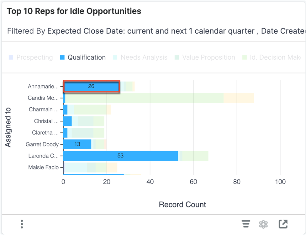
Examples of insights that can be gained from this visualization include:
Use the visualization to:
This visualization illustrates how opportunities flowed through your sales cycle. The y-axis represents each sales stage in your sales process, and the color stacks represent which stage the opportunity transitioned to for all activity over the past year. This visualization does not include Closed Won and Closed Lost as beginning sales stages.
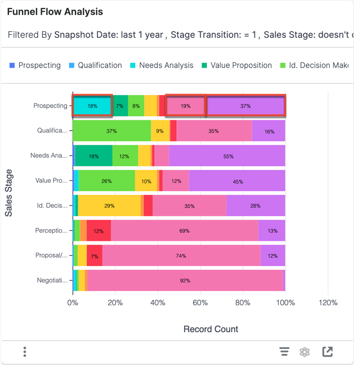
Examples of insights that can be gained from this visualization include:
Use the visualization to:
This visualization shows how the forecast has changed in the last 7 days, with the total forecasted pipeline at the beginning (i.e., 7 days ago) and end (i.e., today) of the week as blue bars on the left and right of the chart, respectively. Between the blue bars, green, red, and yellow bars display increases, decreases, and closed won opportunities. Increases and decreases are further subdivided based on the type of activity that increased or decreased in value from the forecast.
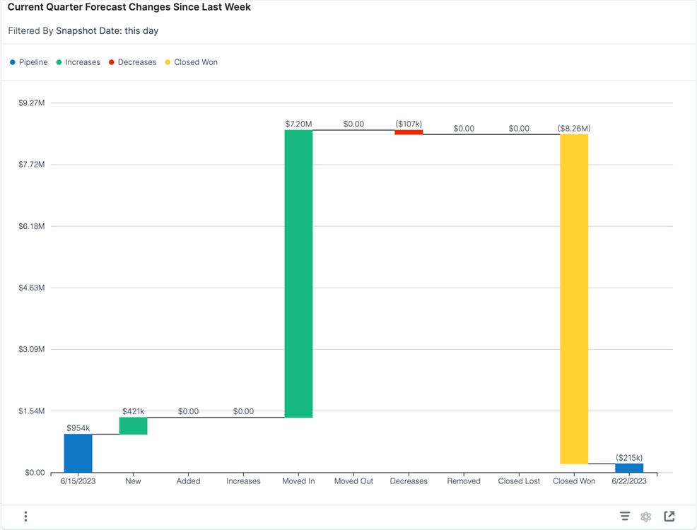
Examples of insights that can be gained from this visualization include:
Use the visualization to:
Here are some reasons why measuring sales velocity is important:
Use these visualizations to track sales velocity over time and across the stages of your marketing and sales funnels.
This visualization shows the average days spent in each stage of your sales process for opportunities that transitioned through those stages during the last 10 months. Users can see where sales velocity is increasing or decreasing in specific areas of the sales process and in which month(s) the sales velocity was slow or fast. This visualization does not include any opportunities that are closed won or close lost.
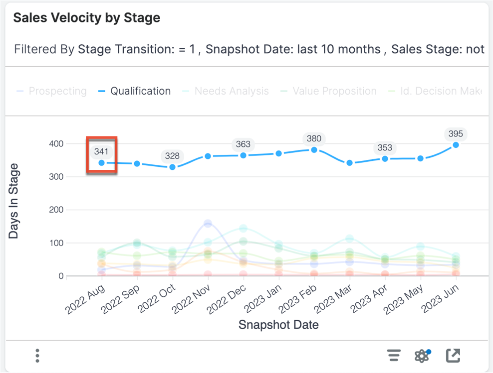
Examples of insights that can be gained from this visualization include:
Use the visualization to:
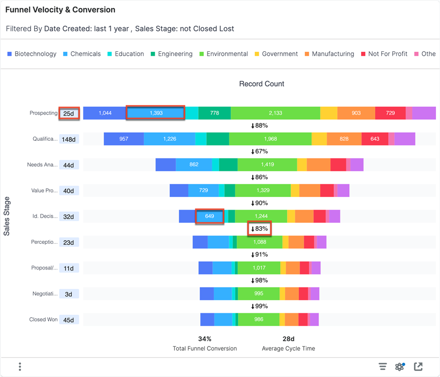
The values along the left side of the funnel show the average number of days that the opportunities stayed in that stage of the sales cycle. These values only include the records that flowed through a given stage and ignore records that either have yet to progress that far, skipped that stage in the sales process, or spent under a day in the stage.
Each funnel stage (horizontal bar) provides the number of records that progressed at least that far in the sales cycle. Records can have spent time outside the stage to be considered part of this count. The percentage between the stages indicates what percent of the previous stage got at least as far as the next stage.
At the bottom of the funnel, there are two summary metrics.
This visualization does not support drill-down. However, it does support comparisons with the ability to highlight relevant data.
Examples of insights that can be gained from this visualization include:
Use the visualization to:
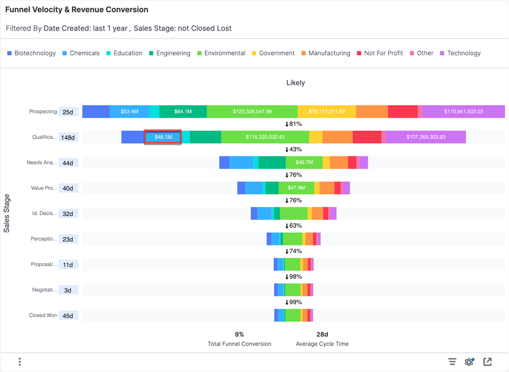
This visualization is like the Funnel Velocity & Conversion Visualization, except instead of viewing conversion based on opportunity count, it is based on the sum of revenue dollars. It includes opportunities that were created in the past year and excludes opportunities that are in the Closed Lost stage. The revenue associated with each record is the revenue when the record entered the stage.
This visualization does not support drill-down.
Examples of insights that can be gained from this visualization include:
Use the visualization to:
Here are some reasons why sales pipeline trends are important:
Use these visualizations to quickly see key business trends over time, including average deal size, win rates, sales cycles, and idle opportunities.
This visualization shows the average deal size for opportunities with expected close dates in each of the last 10 months so that you can find positive or negative trends within key business segments.
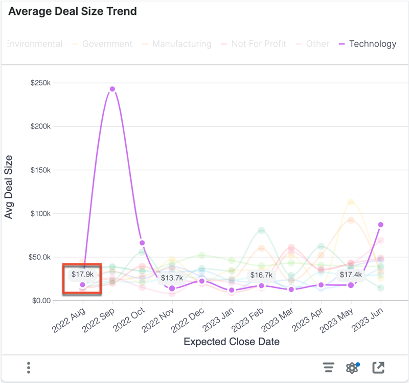
Examples of insights that can be gained from this visualization include:
Use this visualization to:
The win rate is the number of "Closed Won" opportunities with an expected close date in the indicated month and segment divided by the total number of closed items with an expected close date in the indicated month and segment. Closed items include items that are in the "Closed Won" or "Closed Lost" stage.
This visualization shows the win rate for opportunities with expected close dates in each of the last 10 months so that users can see positive or negative trends within specific business segments.
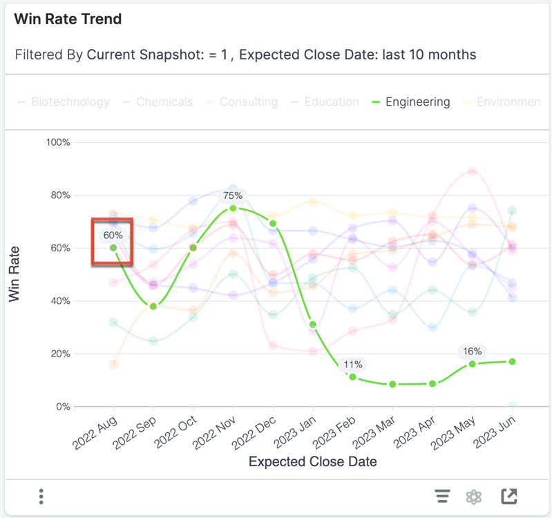
Examples of insights that can be gained from this visualization include:
Use this visualization to:
This visualization shows the sales cycle trend for opportunities with expected close dates in each of the last 10 months, helping users see positive or negative trends within specific business segments.
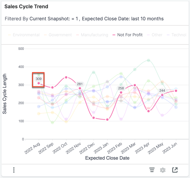
Examples of insights that can be gained from this visualization include:
Use this visualization to:
This visualization shows the number of idle opportunities on the last day of the trailing ten months. This visualization only includes opportunities created within the last 2 years.
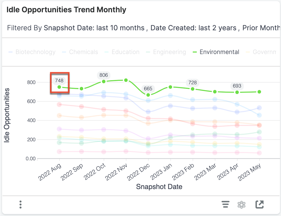
Examples of insights that can be gained from this visualization include:
Use the visualization to:
This visualization shows the total pipeline generated over the past six months. Opportunities created in the last six months are segmented by the month in which they were created. The pipeline revenue (bar graph) represents the current value of all opportunities created in the specified month. The breakdown of sections within the column shows what Sales Stage those opportunities are currently in.
It illustrates how quickly the pipeline matures relative to when it was created. The count of opportunities (line chart) provides a visual representation of how many records were created in each month. This means you can quickly assess the relationship between the pipeline amount and the number of sales opportunities generated. In addition, the visualization provides a relative comparison of deals and pipeline generated from month to month.
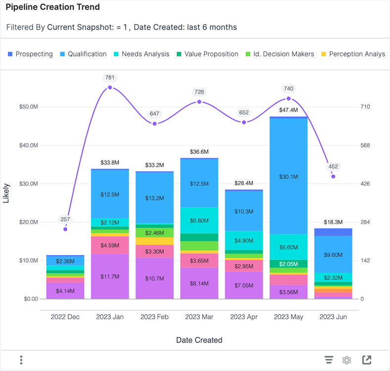
Examples of insights that can be gained from this visualization include:
Use this visualization to:
Sales pipeline forecasting is important for sales performance because it can help you:
Use these visualizations to compare past and current forecast performance to build data-backed forecast predictions for the future.
This visualization shows a historical comparison of your total pipeline for the current quarter compared to the pipeline on the same day in previous quarters. The y-axis displays the likely revenue for opportunities with an expected close date in each quarter. This visualization does not include any opportunities that are closed lost or have moved to the Closed Lost stage. It only includes closed won opportunities and open pipeline.
Each bar also shows Closed Won versus open pipeline (e.g., Committed and Upside) so that you can see how your open pipeline changes over time.
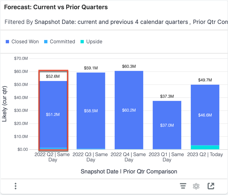
Examples of insights that can be gained from this visualization include:
Use the visualization to:
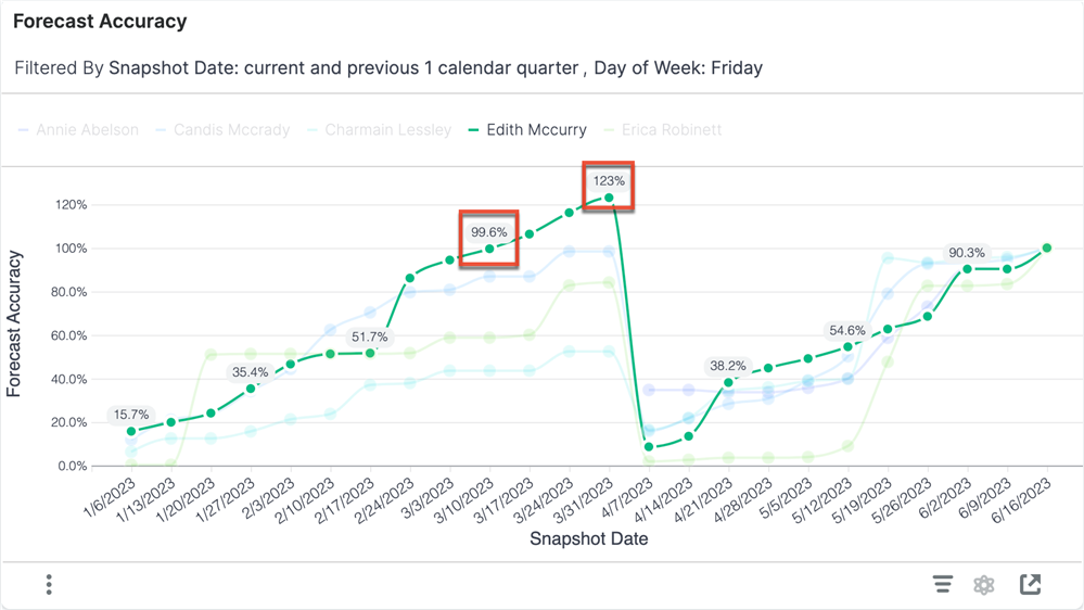
This visualization shows a simple forecast accuracy metric over time. The forecast accuracy calculation is recorded each Friday for the current and the previous calendar quarter.
A forecast accuracy above 100% indicates that the seller overestimated their sales on that day, while a forecast accuracy below 100% indicates that the seller underestimated their sales.
This visualization does not support drill-down.
Examples of insights that can be gained from this visualization include:
Use the visualization to:
This visualization displays the top 20 committed opportunities with the highest total likely revenue for the current quarter. This includes opportunities with an expected close date within the current quarter, are included in the forecast (i.e., the Forecast Stage field is set to "Include"), and are not yet marked closed won or closed lost.
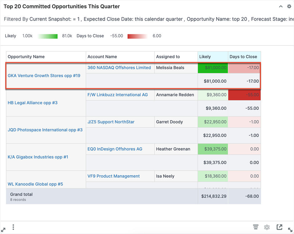
Examples of insights that can be gained from this visualization include:
Use the visualization to:
This visualization displays the top 20 upside opportunities with the highest total likely revenue for the current quarter. These opportunities have an expected close date within the current quarter, are not committed to the forecast (i.e., the Forecast Stage field is set to "Exclude"), and are not yet marked closed won or closed lost.
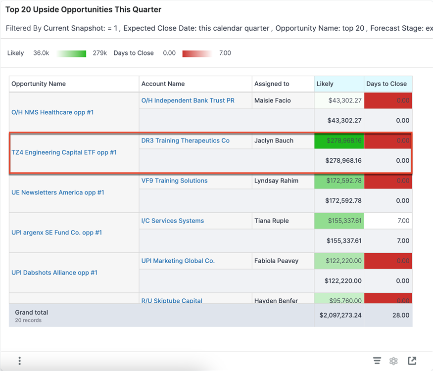
Examples of insights that can be gained from this visualization include:
Use this visualization to:
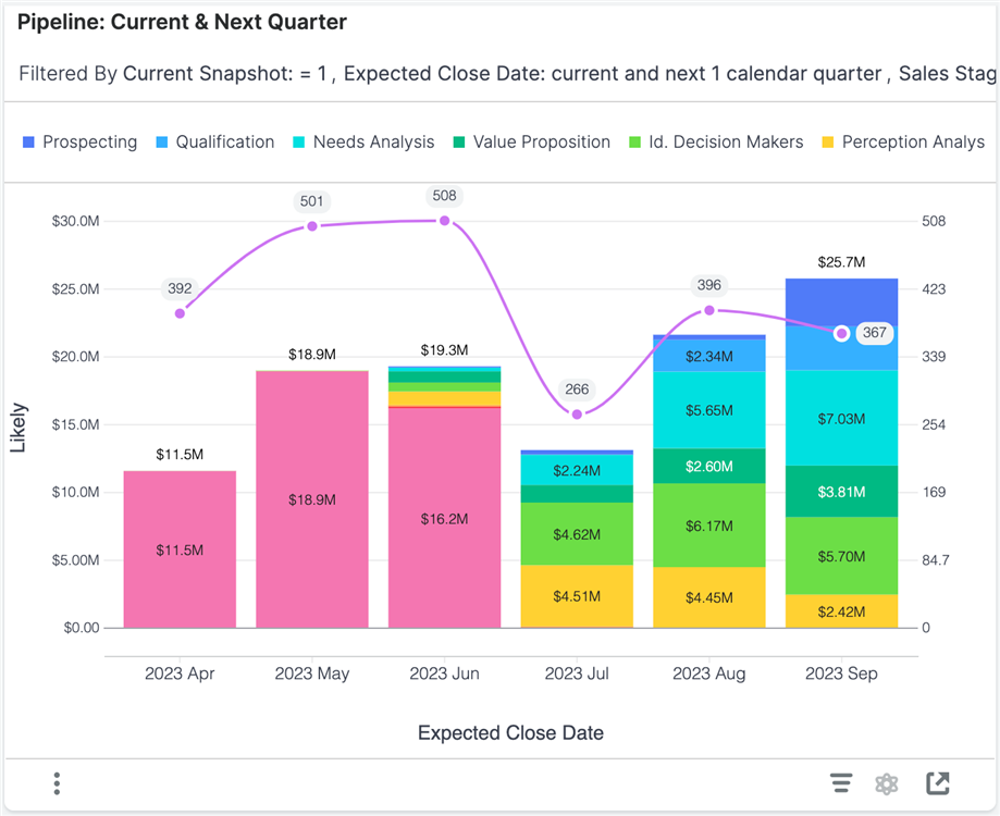
This visualization shows the total pipeline remaining for the current quarter and the total pipeline for the next quarter in terms of revenue (bar graph), and opportunity count (line plot). The expected close date of the opportunities determines the pipeline each quarter. Pipeline revenue is further broken down by Sales Stage to indicate pipeline maturity. This chart excludes opportunities in the "Closed Lost" stage so you can focus on your active pipeline.
Each column represents the total likely revenue for opportunities with an expected close date in the given month.
Examples of insights that can be gained from this visualization include:
Use this visualization to:
For additional information, including the fields used for each visualization and additional Enhanced Forecasting capabilities and visualizations, view the support documentation here. Or, check out the learning course here to see these dashboards in action and test your knowledge.


