Beginning in January 2023 with the 12.3 release of Sugar Sell and Sugar Serve, we're updating the look and feel of the SugarCRM platform with a UI redesign. This redesign is based on direct customer feedback, research, and design best practices, and we couldn't be more excited to share it with you!
The redesigned UI experience will also be available for Sugar Enterprise on-premises with the 13.0 release beginning in April 2023. A full Sugar Market UI redesign will also be available on January 23, 2023 for all users.
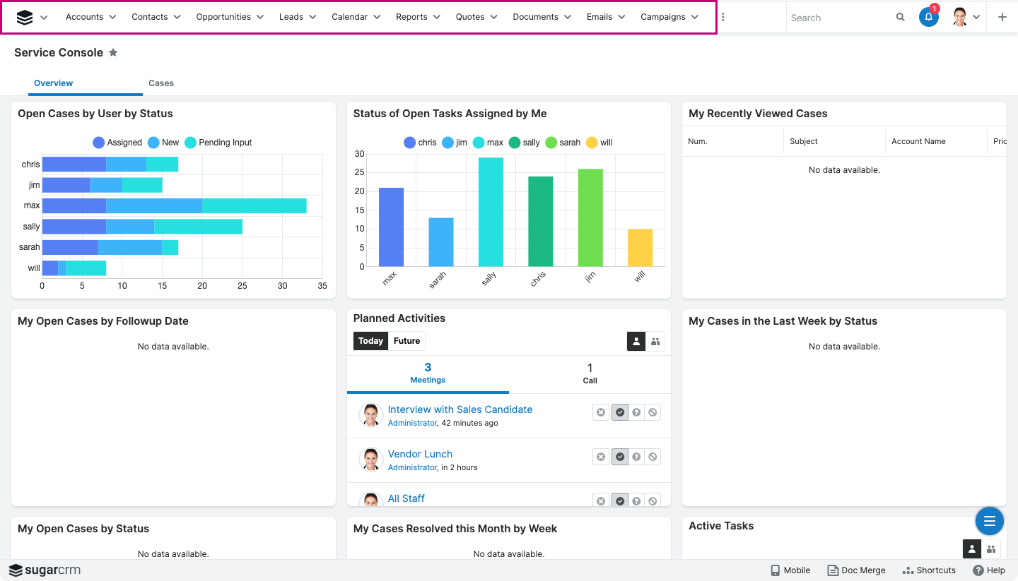
Moving the primary navigation from the top to the left allows for clear separation between navigation and content. The secondary menu structure remains the same.
| Previous UI | Redesigned UI |
 |
 |
| Click images to expand |
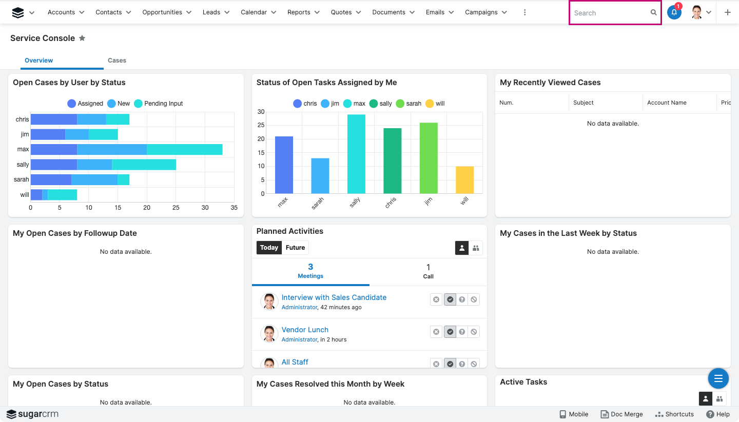
The search bar is now front and center to allow for ease of use.
| Previous UI | Redesigned UI |
 |
 |
| Click images to expand |
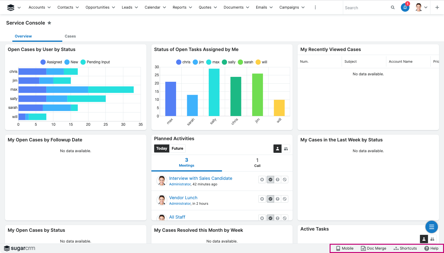
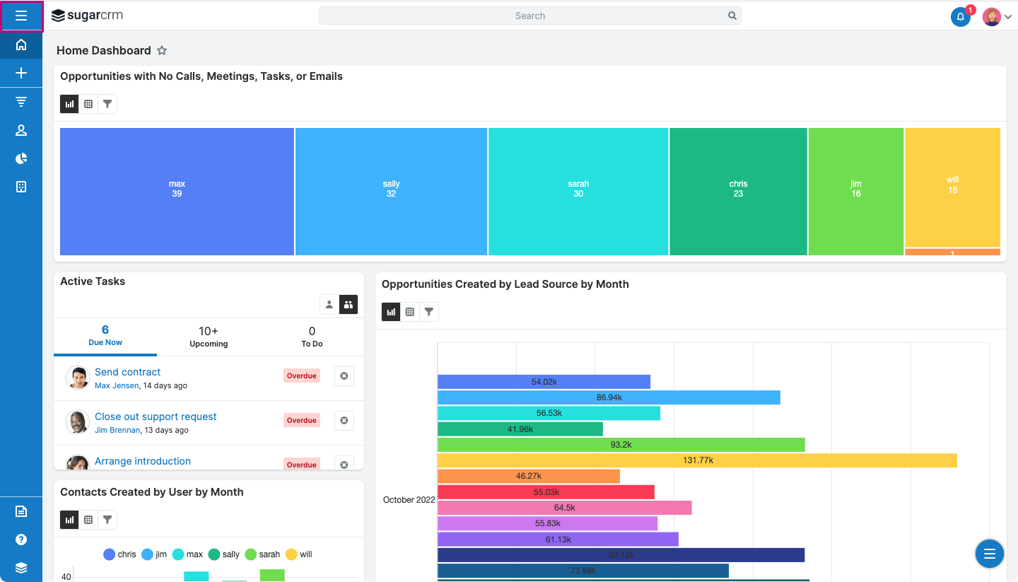
To maximize workspace, footer elements have been moved to the left navigation or into menus.
| Previous UI | Redesigned UI |
 |
 |
| Click images to expand |
Additionally, you can find your new Open button (three-line icon) here. You can click this to see additional modules.
|
Sugar has introduced the concept of "Pinned Modules" as part of UI redesign. Four module icons are always visible to users. Note: if a user focuses on a module that is not on the pinned items, it will be added as the fifth element on the screen. FYI: The decision to limit to four modules was made due to customer feedback that most users only use 3-4 modules on a daily basis. If you would like to expand your number of modules, please reach out to support. In 13.0, we will release the ability to easily expand this number without support intervention. |
 |
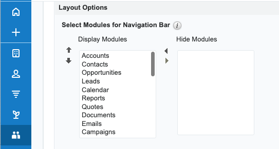
Users have full control over the order their modules are shown/pinned to improve their day-by-day operations. Users can access these options in their user profile under "layout options."
| Note: Some implementations may consist of many modules. When expanding the Sidebar, using the Open button at the top, users will be able to access all their modules in a scrollable list. | 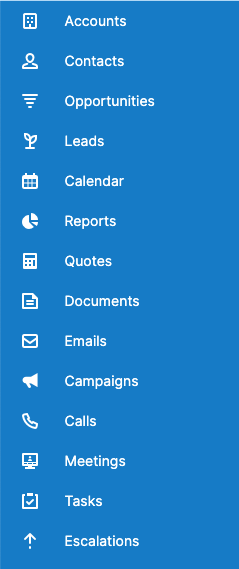 |
|
Sugar will use this placeholder icon when a module does not have an icon defined. Administrators can also use an abbreviation instead of an icon if that makes more sense to their users. Note: Abbreviations are language specific. |
 |
Sugar has completely redesigned its former "Rename Modules" functionality to “Module Names and Icons.”
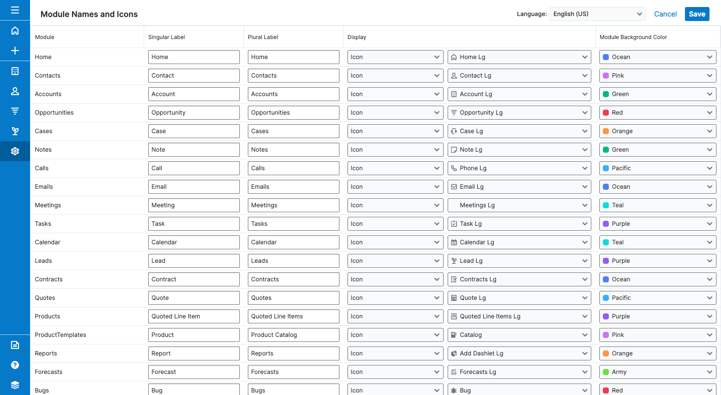
This functionality provides a new way for Sugar Administrators to display either an icon or an abbreviation for a module in the sidebar.
For example, if the display is "Abbreviation,” the two-letter text and background color are used instead of an icon. See the example below.

If the display is an icon, Sugar administrators should choose an icon from the dropdown list.
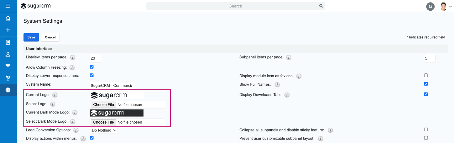
Admins can now replace the standard SugarCRM logo in the left-hand corner with a logo that matches their brand. To change the logo, admins should navigate to the Admin screen and select “System Settings.” Once in the System Settings screen, they can upload their logo files for both light and dark modes. Logo requirements: PNG or JPG file with max dimensions of 28x200 px. If a larger file is selected, the image will be scaled down to 28x200 px.
Note: File names must not contain a space character.
Sales and customer service reps can now get all the key customer information they need on one screen, without the need to open new windows or use the back button to navigate through different modules.
With new Focus Drawer tabs, each record link clicked in a focus drawer opens a new tab within the same focus drawer. This replaces the previous “breadcrumb” model. Each focus drawer tab is identified with the corresponding module icon or abbreviation and the name of the corresponding record.
Additionally, you can now view an entire record view in focus drawers by clicking on the title of a record view dashlet. This provides a view into the full details of a record and allows agents to take action.
This new feature is a great way to increase productivity for Serve/Sell agents as they now can quickly view the details of any record link within the focus drawer without having to leave the focus drawer screen. Additionally, users can easily navigate across the tabs within the focus drawer without closing any of the opened focus drawer tabs.
This allows the consoles to become the services and sales agent’s one-stop workspace.
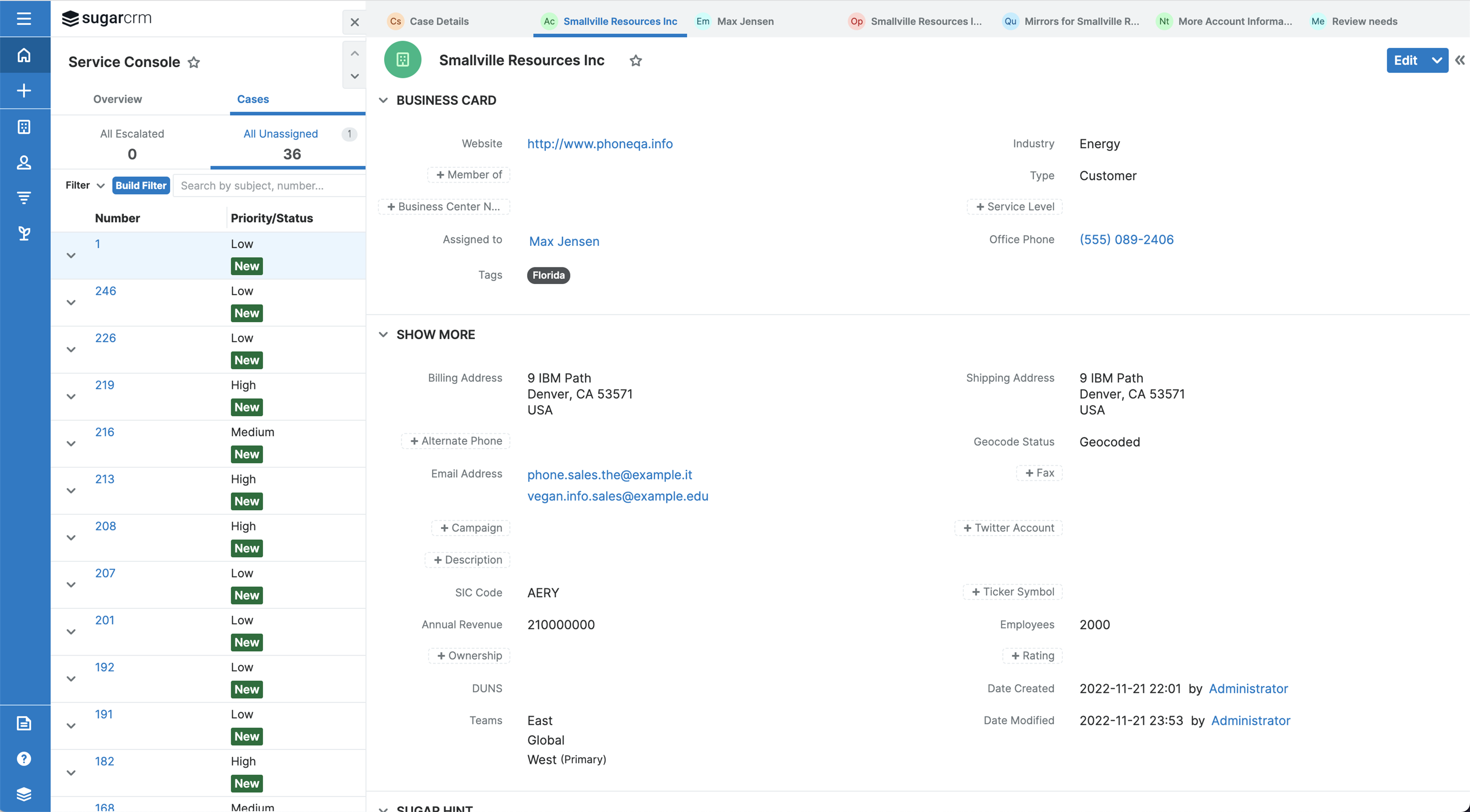
All business users can use this feature by clicking on the record links or the focus drawer icon within the focus drawers. The new tabs are fully responsive and adjust based on browser screen size.
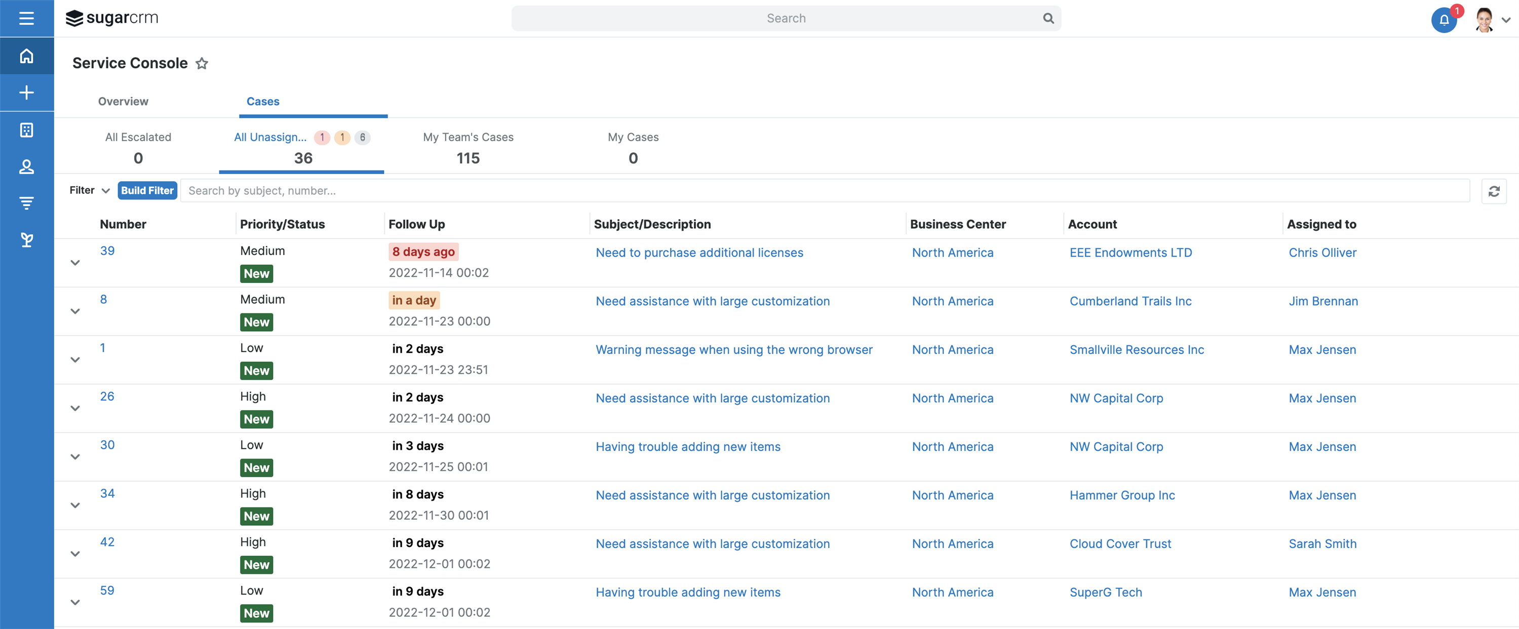
With this release, we have made several console usability enhancements to improve the service and sales agent’s experience.
For example, agents can now resize columns as needed. They will be able to click on any of the record links on the multiline list view (e.g., Account column is now a link that opens the account’s record view in a focus tab) and Overview tab to open the record view within the focus drawer on the Console.
This makes it easy for sales service agents to access all the records they need to see in one view. It also means fewer clicks—giving customer service agents more time to offer their customers a fantastic experience.
For additional information about new UI features, please visit our SugarClub UI redesign post.
For a full PDF download of this post, click here, or watch the video below.


Top Comments