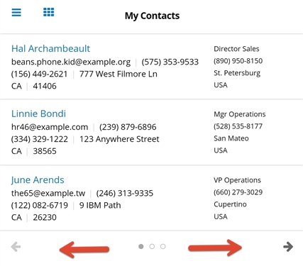
Version 51.0 of the SugarCRM mobile app was released last week and one of the new features slightly changes how you swipe between dashlets. It's worth noting to avoid some confusion while discovering it on your own.
Before, you could swipe left or right anywhere on the dashlet to switch to other dashlets in the dashboard. In version 51.0, you can't swipe just anywhere to switch to the next dashlet. You can still swipe, but only in the bottom navigation bar with the arrows. This was to free up the swiping motion for opening the record actions menu on dashlets containing lists of records. For consistency, the change was made across all dashlet types.
Alternatively, you can still tap the arrow icons to go back and forth, which is the same as before.
While this is a minor change, if you work in dashlets a lot, I can see this causing confusion and some experimental swiping around the screen, so I wanted to alleviate some of that if possible!
-Brenda
