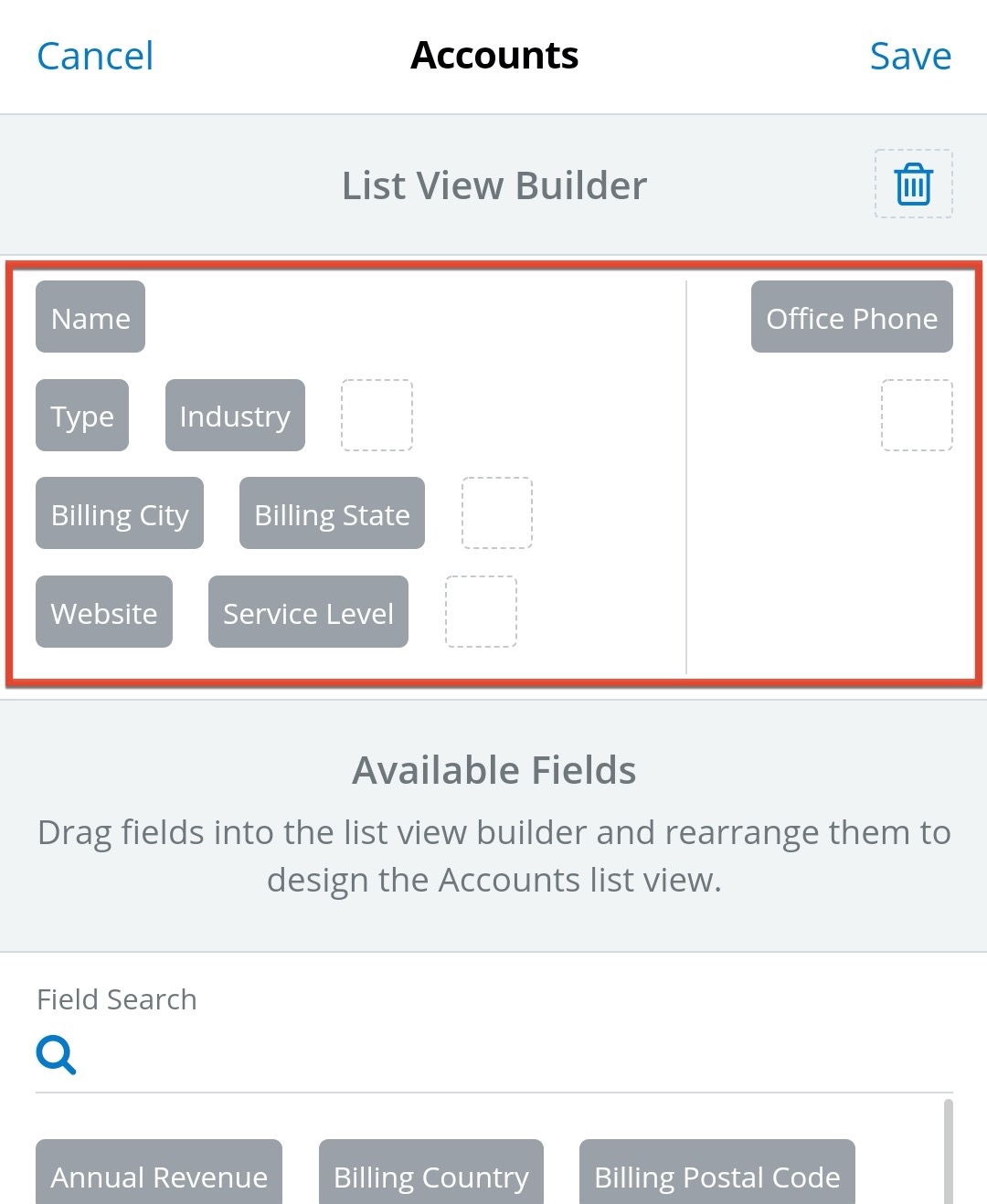
Sugar Mobile 31.0, currently targeted to hit the Google Play and Apple app stores in the next week or so, gives mobile users tons of flexibility to design their list views how they want. You'll be able to (finally!) set up the layout of each list view - putting the data you use the most within view as you scroll.
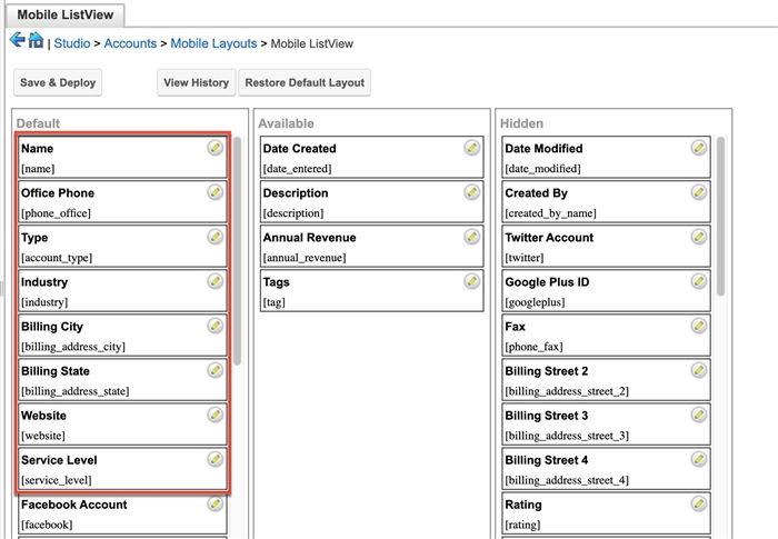
If you're an admin, set your mobile users up for success by making sure your mobile list view layouts in Studio are optimized for this new feature before upgrade. The first eight fields in the Default column will automatically be shown on list view - completely different from how it currently works, where only the first two fields are shown. It's a good idea to take a look at the fields you have there to ensure a reasonable set of data will be shown to users by default. All of the fields in the Available column will also be available for users to put onto their views, so it's a good idea to review those too.
Similar to how list view configuration works in desktop Sugar, when users make changes to list view layouts, those layouts will take precedence over the admin's Studio configuration. So your list view config doesn't need to be perfect, just a good starting point. Your users will take it from there and make each list view their own!
Studio: Mobile ListView Config

List View Builder on Mobile

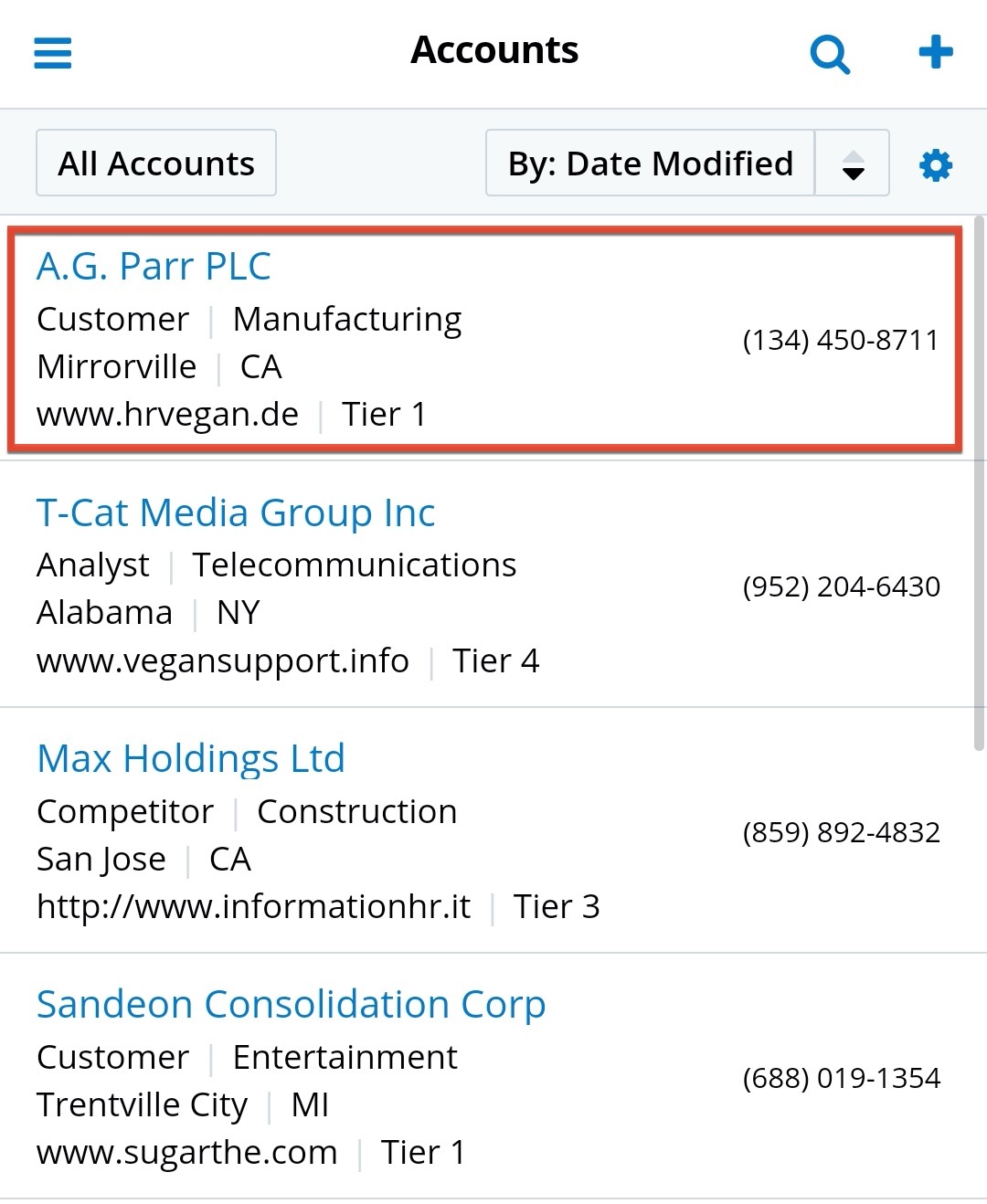
Updated List View

Watch the documentation for the Sugar Mobile 31.0 release notes and the updated Android and iOS user guides for details on this new feature once it's live!
