
Hello Sugar Club,
We are currently trying to generate charts that illustrate our customers’ energy consumption. Our goal is to create a graph where the y-axis represents the total energy capacity (in given units) and the x-axis represents time in years.
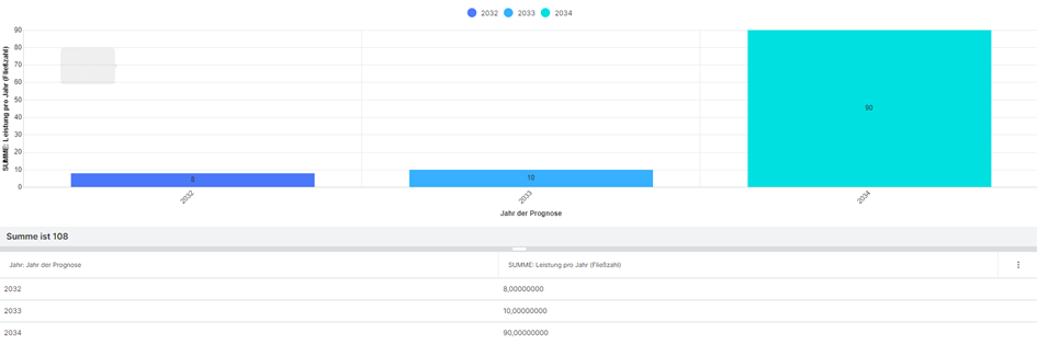
So the chart should look like this:
But this is only working if we use multiple module entries for each forecasted year.
The entry for each company in our sugar looks like this:

So what we need is a chart with multiple columns in the x-axis. For each customer, the sum of all customers and a part of our customers.
Unfortunately, we couldn’t find a way to incorporate the dates differently in the field section, despite experimenting with alternative fields such as dropdown fields. We also tried various report types but couldn’t find a chart that uses all power entries (Leistung 2025, Leistung 2026, Leistung 2027, etc.) in one chart.
Is there anything we can do better?
Thank you in advance.
Ingmar