How to make Revenue Line Items panel more usable

Good evening,

We've a SugarSell 13.3 instance configured with the Revenue Line Items module (renamed in Product). 
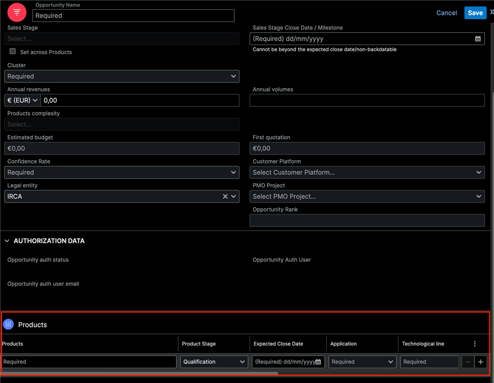
It works but it's not very usable since you have a single line with many fields (as you can see in my screenshot).
In addition you have also the possibility to remove fields from the list, avoiding mandatory ones. Take a look at my post:
sugarclub.sugarcrm.com/.../required-is-not-checked-if-one-field-is-not-exposed-in-the-listview

Is there the possibility to make the Product section below more usable and safe? The picklist aren't readable with long labels and you need to resize the columns.
Is it possibile to have a single column view? Or the full Product (Revenue Line Item) Layout?

Thanks

Parents
  • For a couple of customers we added a 3 layer product selection, like Product Type, Product Category and Product Tempate, this way we have a kind of wizard for product selection.

    Additionally it is possible to automatically force a larger column for the product name, this way you will be able to see the entire description.

    Both strategies require coding.

    André Lopes
    Lampada Global
    Skype: andre.lampada
Reply
  • For a couple of customers we added a 3 layer product selection, like Product Type, Product Category and Product Tempate, this way we have a kind of wizard for product selection.

    Additionally it is possible to automatically force a larger column for the product name, this way you will be able to see the entire description.

    Both strategies require coding.

    André Lopes
    Lampada Global
    Skype: andre.lampada
Children
No Data