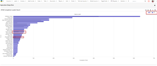
It would be really nice to be able to adjust dashlet chart color schemes as an administrator without having to go to a developer to code it. Some of the defualt color scheme's do not have enough variation.

It would be really nice to be able to adjust dashlet chart color schemes as an administrator without having to go to a developer to code it. Some of the defualt color scheme's do not have enough variation.

Hi Leaya, that would definitely be helpful! There is actually an open enhancement request for this feature: bug #46555. If you want to share your desire for the feature, you could contact Support so they can add your request for tracking purposes. Then Sugar will have a more accurate understanding of how many people are interested.
-Brenda
this enhancement seems like a no brainers that nearly all sugar users would want to see in play.
And really shouldn't be too complex? Not sure why it hasn't been implemented.
Hi Leaya, i'm with you here - I work in Presales at Sugar and this comes up quite a bit. Be great if there was a selection of different themes you could pick from and then have a custom option.
In the meantime, here is an example custom.less file you can use to edit the colours. It needs to be put in the instance name/custom/themes directory of your instance. You will need to check/match up the elements to your instance but it might point you in the right direction.
@cstm_purple1 : #5955a5;
@cstm_purple2 : #42468c;
@cstm_purple3: #7b7da6;
@cstm_purple4: #606ba6;
@cstm_purple5: #a4a6bf;
@cstm_purple6: #e6e6f2;
@cstm_purple7: #f5f5f5;
@cstm_purple8: #9997c9;
@cstm_purple9: #8c88d8;
@cstm_purple10: #5955a5;
@cstm_purple11: #353262;
@cstm_purple11: #474483;
@cstm_purple12: #a5a1f1;
@cstm_purple13: #6955a5;
@cstm_purple14: #7955a5;
@cstm_white: #ffffff;
@cstm_grey1: #747474;
@cstm_grey2: #d9d4d0;

// @mint => @sc-fill00, @sc-stroke00
.sc-fill00, .sc-stroke00 {
  fill: @cstm_purple1;
  background-color: @cstm_purple1;
  color:  @cstm_purple1;
  stroke:  @cstm_purple1;
}
// @green => @sc-fill01, @sc-stroke01
.sc-fill01, .sc-stroke01 {
  fill: @cstm_purple4;
  background-color: @cstm_purple4;
  color:  @cstm_purple4;
  stroke:  @cstm_purple4;
}
// @army => @sc-fill02, @sc-stroke02
.sc-fill02, .sc-stroke02 {
  fill: @cstm_grey1;
  background-color: @cstm_grey1;
  color:  @cstm_grey1;
  stroke:  @cstm_grey1;
}
// @yellow => @sc-fill03, @sc-stroke03
.sc-fill03, .sc-stroke03 {
  fill: @cstm_purple5;
  background-color: @cstm_purple5;
  color:  @cstm_purple5;
  stroke:  @cstm_purple5;
}
// @orange => @sc-fill04, @sc-stroke04
.sc-fill04, .sc-stroke04 {
  fill: @cstm_purple8;
  background-color: @cstm_purple8;
  color:  @cstm_purple8;
  stroke:  @cstm_purple8;
}
// @red => @sc-fill05, @sc-stroke05
.sc-fill05, .sc-stroke05 {
  fill: @cstm_purple2;
  background-color: @cstm_purple2;
  color:  @cstm_purple2;
  stroke:  @cstm_purple2;
 }
// @pink => @sc-fill06, @sc-stroke06
.sc-fill06, .sc-stroke06 {
  fill: @cstm_purple9;
  background-color: @cstm_purple9;
  color:  @cstm_purple9;
  stroke:  @cstm_purple9;
}
// @purple => @sc-fill07, @sc-stroke07
.sc-fill07, .sc-stroke07 {
  fill: @cstm_grey2;
  background-color: @cstm_grey2;
  color:  @cstm_grey2;
  stroke:  @cstm_grey2;
}
// @night => @sc-fill08, @sc-stroke08
.sc-fill08, .sc-stroke08 {
  fill: @cstm_purple10;
  background-color: @cstm_purple10;
  color:  @cstm_purple10;
  stroke:  @cstm_purple10;
}
// @blue => @sc-fill09, @sc-stroke09
.sc-fill09, .sc-stroke09 {
  fill: @cstm_purple3;
  background-color: @cstm_purple3;
  color:  @cstm_purple3;
  stroke:  @cstm_purple3;
}
//@ocean => @sc-fill10, @sc-stroke10
.sc-fill10, .sc-stroke10 {
  fill: @cstm_purple11;
  background-color: @cstm_purple11;
  color:  @cstm_purple11;
  stroke:  @cstm_purple11;
}
//@pacific => @sc-fill11, @sc-stroke11
.sc-fill11, .sc-stroke11 {
  fill: @cstm_purple12;
  background-color: @cstm_purple12;
  color:  @cstm_purple12;
  stroke:  @cstm_purple12;
}
//@teal => @sc-fill12, @sc-stroke12
.sc-fill12, .sc-stroke12 {
  fill: @cstm_purple13;
  background-color: @cstm_purple13;
  color:  @cstm_purple13;
  stroke:  @cstm_purple13;
}
//@coral => @sc-fill13, @sc-stroke13
.sc-fill13, .sc-stroke13 {
  fill: @cstm_purple14;
  background-color: @cstm_purple14;
  color:  @cstm_purple14;
  stroke:  @cstm_purple14;
}

.module-list .megamenu>.dropdown .module-name {
  color: @cstm_grey1;
}

.module-list .megamenu>.dropdown.active .module-name {
  color: @cstm_purple1;
  font-weight: 500;
  text-decoration: none;
  font-family: "OpenSans", Helvetica, Arial, sans-serif;
  font-size: 14px;
  -webkit-transition: all 150ms ease-in-out;
  -o-transition: all 150ms ease-in-out;
  transition: all 150ms ease-in-out;
}

.navbar .megamenu>.dropdown:hover {
  background: @cstm_white;
  color: @cstm_purple1;
}

.navbar .megamenu>.dropdown.active .btn-group:not(.open):not(.home) {
  background-color: @cstm_white;
}

// Option 1
//.btn-primary {
//  color: #fff;
//  text-shadow: 0 -1px 0 rgba(0,0,0,0.25);
//  background-color: @cstm_purple2;
//  background-image: linear-gradient(to bottom, @cstm_purple1, @cstm_purple1);
//  background-repeat: repeat-x;
//  border-color: @cstm_purple1 @cstm_purple1 @cstm_purple2;
//  border-color: rgba(0,0,0,0.1) rgba(0,0,0,0.1) rgba(0,0,0,0.25);
//}
//
//.btn-primary:not(.disabled):not(.btn-invisible):hover {
//  box-shadow: none;
//  border: solid 1px @cstm_purple4;
//  background: @cstm_purple3;
//};

// Option 2

.btn-primary {
  color: @cstm_purple1;
  text-shadow: 0 -1px 0 rgba(0,0,0,0.25);
  background-color: @cstm_purple1;
  background-image: linear-gradient(to bottom, @cstm_white, @cstm_white);
  background-repeat: repeat-x;
  border-color: @cstm_purple1;
}

.btn-primary:not(.disabled):not(.btn-invisible):hover {
  box-shadow: none;
  border: solid 1px @cstm_purple2;
  background: @cstm_purple1;
}

.navbar .megamenu>.dropdown .dropdown-menu li a:focus, .navbar .megamenu>.dropdown .dropdown-menu li a:hover {
  color: #fff;
  background: @cstm_purple1;
}

a, a:hover{
  color: @cstm_purple1;
}

.headerpane .btn-toolbar .btn-group .btn:not(.btn-primary), .headerpane .btn-toolbar .btn-group .btn:not(.btn-primary).dropdown-toggle .fa {
  color:@cstm_purple1;
}

.dropdown-menu li>a:hover, .dropdown-menu li>a:focus, .dropdown-menu li>button:hover, .dropdown-menu li>button:focus, .dropdown-menu li>span>button:hover, .dropdown-menu li>span>button:focus, .dropdown-menu li>span>a:hover, .dropdown-menu li>span>a:focus, .dropdown-menu .active>a, .dropdown-menu .active>span>a, .dropdown-menu .active>a:hover, .dropdown-menu .active>a:focus, .dropdown-menu .active>span>a:hover, .dropdown-menu .active>span>a:focus {
  color: #fff;
  text-decoration: none;
  background: @cstm_purple1;
  filter: none;
}

.btn.btn-link {
  color: @cstm_purple1;
}

.btn-group .dropdown-toggle:active .btn.btn-primary.dropdown-toggle, .btn-group.open .btn.btn-primary.dropdown-toggle {
  background-color: @cstm_purple1;
}

.filter-view .choice-related, .filter-view .choice-filter {
  background: @cstm_purple1;
}

.megamenu>.dropdown .btn-group:not(.open)>.btn:focus, .megamenu>.dropdown .btn-group:not(.open) .btn.module-name:focus {
  outline: dotted 1px @cstm_purple1;
}

.module-list .megamenu>.dropdown .module-name:focus, .module-list .megamenu>.dropdown .module-name:hover {
  color: @cstm_purple1;
}

a:link, a:visited {
  color: @cstm_purple1;
}

.btn.btn-link:not(.disabled):hover {
  color: @cstm_purple1;
}

.btn>.fa {
  color: @cstm_purple1;
}

.navbar .megamenu>.dropdown:hover .btn-group>.btn, .navbar .megamenu>.dropdown:hover .btn-group>.btn:hover {
  color: @cstm_purple1;
}

.select2-results li div:hover, .select2-results .select2-highlighted {
  background: @cstm_purple1;
}

textarea:focus, input[type="text"]:focus, input[type="password"]:focus, input[type="datetime"]:focus, input[type="datetime-local"]:focus, input[type="date"]:focus, input[type="month"]:focus, input[type="time"]:focus, input[type="week"]:focus, input[type="number"]:focus, input[type="email"]:focus, input[type="url"]:focus, input[type="search"]:focus, input[type="tel"]:focus, input[type="color"]:focus, .uneditable-input:focus {
  border-color: @cstm_purple1 !important;
}

footer .logo img {
  max-height: 29px;
}
Good news! This Idea that Brenda Rossetto referenced has been implemented in the most recent Sugar release, Sugar Sell Q3 2024 . Please see the release notes for additional information: https://support.sugarcrm.com/documentation/sugar_versions/14.1/sell/sugar_14.1.0_release_notes/#Reports
I'm sorry, but this idea has been reopened since it was not fully implemented. We now have consistent chart coloring, but the chart colors are not yet configurable. Please continue to refer to Idea 46555 for the configuration options request.
Hi Alex Nassi , I would love to contribute to this improvement since several customers here in Brazil ask exactly the same feature.
Let me know if you would like an extra hand in this challenge.
selection of different themes you could pick from and then have a custom option.
I would wish to have this in the personal profile settings, as every user has different preferences.
I was looking into an issue where some chart colors were the same for multiple dropdown options in a list. I was thinking it may be a customization affecting the issue, but what I found looks to be some new functionality introduced as part of the upgrade to 14.1.
It looks like on that upgrade, a new directory was added to the Extension framework:
./custom/Extension/application/Ext/DropdownsStyle
What I found in that directory is a file for each dropdown list in the format of <dropdown list name>_style.php (e.g. call_status_dom_style.php) which has a color designation for each dropdown entry defined:
<?php
 // created: 2024-09-27 20:27:37

$app_dropdowns_style['call_status_dom_style']=array (
  'Scheduled' =>
  array (
    'backgroundColor' => '#517bf8',
  ),
  'Held' =>
  array (
    'backgroundColor' => '#00e0e0',
  ),
  'Canceled' =>
  array (
    'backgroundColor' => '#36b0ff',
  ),
);
I confirmed that adding / removing entries from a dropdown list modifies the respective file. While it isn't UI-accessible, it does at least provide a safer way to modify chart colors where you are grouping by dropdown lists.
Rafael Fernandes - are there plans to add information about this to the Extension framework documentation in the developer guide?
Chris
Hi Chris Raffle ,
you are absolutely right, I'm trying to understand why that feature wasn't documented, but if it is supposed to be, I'll make sure to add that to our guides..
thanks for digging..
rafa
Rafael Fernandes
Staff Developer Advocate | SugarCRM
Hi Chris Raffle ,
just as an FYI, I have added this to our Developer Guide documentation:
There's more coming in the next releases, so when we finalize that I'll add more to it as it becomes available.
Rafael Fernandes
Staff Developer Advocate | SugarCRM