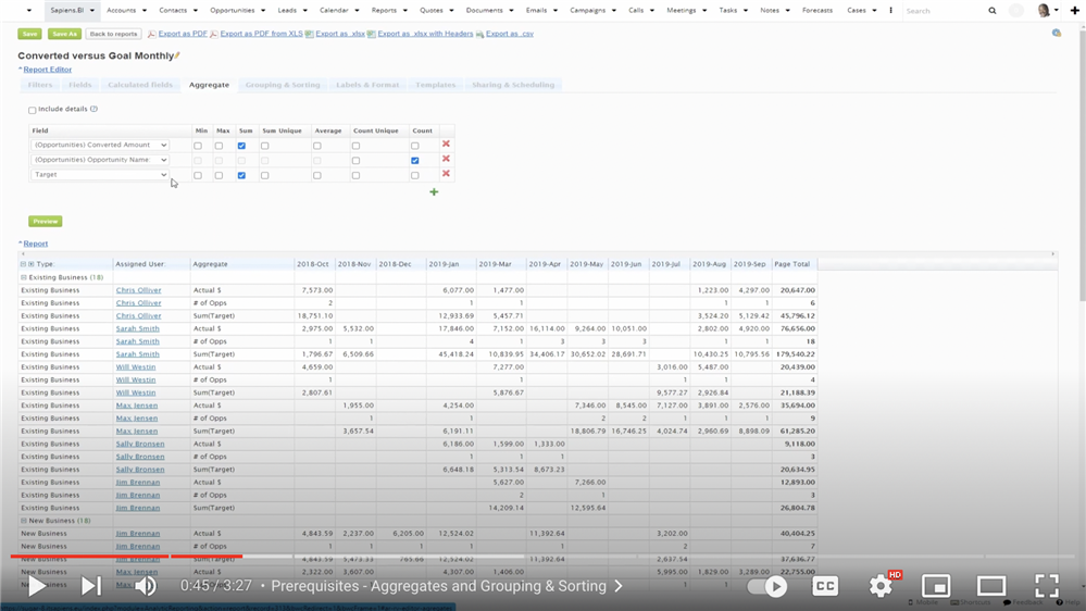
With Combined charts, you can set up a 3rd axis, which allows you to include a surprising amount of complex data in a simple chart. By having two vertical axes, we can add an additional dimension to a chart.
In this example, we have added a secondary vertical axis on the right side and added a red line to show the number of opportunities which corresponds to the right vertical axis.
It can also be useful to stack your data. In this chart, we’ve stacked the sales numbers by each sales representative. Want to learn to set up a combined chart? We’ve made a quick video tutorial to walk you through the two examples listed above.

Watch How to Create Combined Charts
To see the full playlist of all our tutorials for SugarCRM click here.
For more information or to set up a trial please contact:
Barney Lawrence-Jones, Head of Sales (+971 585 066934) barney@itsapiens.eu
For any technical queries please contact:
Eva Narunovska, Founder (+971 585 824484) eva.narunovska@itsapiens.eu
To read more about our available tools, see Sapiens.BI and Sapiens.BI PRO in SugarOutfitters.
