

Human beings best process data with visual cues. Gauge charts are one of the simplest chart types that are both straightforward and effective. They are a fantastic tool to display how close you are to a specific goal which will keep you and your team motivated.
When you put multiple Gauge charts together, it is easy to compare how each employee, team or product is performing.
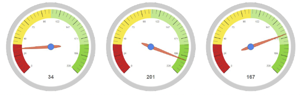
The speed-o-meter is very intuitive. You can customize its colors and add as many ranges as you see fit for your situation.
Want to set up a Gauge chart for your business?
Watch this video tutorial to see a step-by-step guide!

To see the full playlist of all our tutorials for SugarCRM click here.
For more information or to set up a trial please contact:
Barney Lawrence-Jones, Head of Sales (+971 585 066934) barney@itsapiens.eu
For any technical queries please contact:
Eva Narunovska, Founder (+971 585 824484) eva.narunovska@itsapiens.eu
To read more about our available tools, see Sapiens.BI and Sapiens.BI PRO in SugarOutfitters.