Overview
When preparing for your upgrade and code refactoring, please keep in mind that there are some key pieces of functionalities that were redesigned or are expected to behave differently from now on. To help provide you with the necessary information, this article covers what to expect when your instance is upgraded to 12.3.x.
Pinned Modules
Sugar has introduced the concept of "Pinned Modules" as part of UI/UX redesign that consists of 4 (four) modules always available to users.
If a user focuses on a module, not in the pinned items, it will be added as the fifth element on the screen.

The decision to around this number was based on our research with our users that showed users use commonly around 4 (four) modules in their day-by-day operations.
A new Sugar Configuration has been introduced to override this number (careful not to defeat the purpose of this feature and pin "non-essential modules" to the list).
Personalize Module Order
Enhancing the power of "Pinned Modules" comes the ability to personalize the order of those modules.
Users have full decision power on the order modules will show up to improve their day-by-day operations.
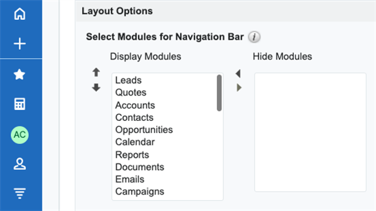
Sugar uses the widely known Layout Options from the Profile page to render those 4 (four) pinned modules.
It's the order user chooses that defined the pinned modules, there is no extra option to pin (top 4 will be shown as pinned).

Note: Advocate your users to do a one-time pass on the Layout Options and order their most common modules to show up first so they'll avoid that much scrolling.
Extensive list of modules
 Some implementations may consist of a massive amount of modules, some surpassing 60 (sixty).
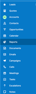
This could be a concern when we move it to the sidebar as modules now are represented by icons when collapsed (even though you will have a tooltip when mousing hover with the module name).
By leveraging the "Pinned Modules" and "Personalize Module Order" functionalities, Sugar provides an easy transition and much better experience to the users that now will see what matters the most at one-click away to get their stuff done.
When expanding the Sidebar, users will get all their modules on a scrollable group to find any modules they'd like to work on.
Advocate your users to do a one-time pass on the Layout Options and order their most common modules to show up first so they'll avoid that much scrolling.
Default icon for Modules
work in progress
Abbreviation vs Icon in Module List
work in progress
Responsiveness for Web Mobile
work in progress
