This new layout is Sugar's main component that hosts overall Menu options structure in the newly redesigned Home Page.
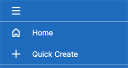
It has been designed to group functionalities in layouts, where each layout/group is separated by a line/divisor within sidebar-nav definition.
Natively on 12.3, Sugar is shipping 4 layouts:
 |
For the sake of simplicity, we’re grouping 2 layouts in this image.
|
 |
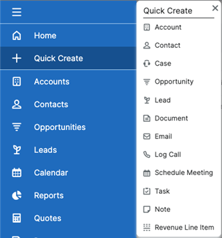
Quick Create view has been redesigned and presents the modules on click. Note this view does not require secondary-action as others with submenu. |
 |
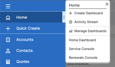
Each item in the menu contains a set of submenus providing the user extra options prior to accessing the functionality (such as header submenus) |
 |
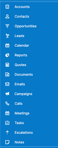
This layout group brings a scrollable modules list (now called sidebar-nav-item-module). It displays all the default modules available to the user ordered by the current user's preference. |
 |
When Sidebar is collapsed, Sugar displays a list of "pinned" modules.
|
 |
This layout group is where Sugar’s footer now resides.
|
Actions
Primary Action
Primary actions are triggered by the click of a button on the sidebar-nav's views. By default if a route property is provided in the view object in the layout metadata, the Primary Action will be a link to the route provided. For example:
$viewdefs[...] = [
    'layout' => [
        'type' => 'sidebar-nav-item-group',
        'name' => 'sidebar-nav-item-group-bottom',
        'css_class' => 'flex-grow-0 flex-shrink-0',
        'components' => [
            [
                'view' => [
                    'name' => 'greeting-nav-item',
                    'type' => '<some-custom-view>',
                    'route' => '#Accounts',
                    ...
                ],
            ],
        ],
    ],
];
Otherwise, if you're using a custom view and the controller has a primaryActionOnClick method defined, that will be used in addition to the route property.
Secondary Action
With the introduction of the sidebar-nav-item component, we’re now introducing secondary actions. These appear by way of a kebab menu when hovering on the sidebar-nav-item container to which they are added.
Secondary Actions do have some default behaviour. If the template has the following markup present, the kebab will render on hover:
<button class="sidebar-nav-item-kebab bg-transparent absolute p-0 h-full">
   <i class="{{buildIcon 'sicon-kebab'}} text-white"></i>
</button>
If metadata is provided with certain keys, clicking on the kebab icon will render a flyout menu. From the Moving Footer Content to Sidebar Nav example, the following metadata is defined in;
./custom/Extension/application/Ext/clients/base/layouts/sidebar-nav/sidebar-nav.php
<?php

$viewdefs['base']['layout']['sidebar-nav']['components'][] = [
    'layout' => [
        'type' => 'sidebar-nav-item-group',
        'name' => 'sidebar-nav-item-group-bottom',
        'css_class' => 'flex-grow-0 flex-shrink-0',
        'components' => [
            [
                'view' => [
                    'name' => 'greeting-nav-item',
                    'type' => 'greeting-nav-item',
                    'route' => '#Accounts',
                    'icon' => 'sicon-bell-lg',
                    'label' => 'Hello!',
                    'flyoutComponents' => [
                        [
                            'view' => 'sidebar-nav-flyout-header',
                            'title' => 'Greetings',
                        ],
                        [
                            'view' => [
                                'type' => 'sidebar-nav-flyout-actions',
                                'actions' => [
                                    [
                                        'route' => '#Accounts',
                                        'label' => 'LBL_ACCOUNTS',
                                        'icon' => 'sicon-account-lg',
                                    ],
                                ],
                            ],
                        ],
                    ],
                ],
            ],
        ],
    ],
];
The flyoutComponents array will render all the views that are pass to it. In this case, we load a sidebar-nav-item-header component and a sidebar-nav-item-flyout-actions component. Similar to a Primary Action, you can override the default secondaryActionOnClick method in your custom view controller to change the behaviour of clicking on the kebab menu.
$viewdefs[...] = [
    'layout' => [
        'type' => 'sidebar-nav-item-group',
        'name' => 'sidebar-nav-item-group-bottom',
        'css_class' => 'flex-grow-0 flex-shrink-0',
        'components' => [
            [
                'view' => [
                    'name' => 'greeting-nav-item',
                    'type' => 'greeting-nav-item',
                    'route' => '#Accounts',
                    ...
                ],
            ],
        ],
    ],
];
You understand the new sidebar-nav, let's get to component mapping:
Move on to Component Mapping.
