How to visually tell the difference between DEV, QA, UAT, Etc.

Imitation is the Sincerest Form of Flattery, thanks to Kenneth Brill’s idea, I have created a Module Loadable Package that implements the concepts found in the post Visually mark your Dev, QA, and Production servers. In the post, Ken discusses how he implemented adding a watermark in order to know which instance you are working on.

Download the Module Loadable Package from sugardevelopersguide.substack.com
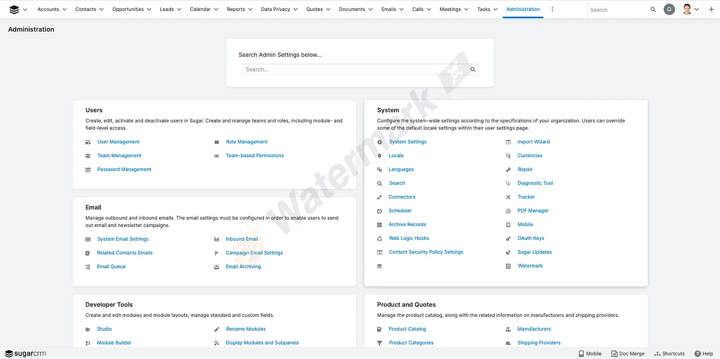
Watermark

  • Nice solution.


    We simply color code the Navigation Bar by setting the colors conditionally based on the site url in the config.

    custom/themes/clients/base/default/variables.php

    global $sugar_config;
    if(strpos($sugar_config['site_url'], 'dev')!== false){
      $lessdefs['colors']['BorderColor'] = '#ccccff';
      $lessdefs['colors']['NavigationBar'] = '#bb99ff';
    }elseif(strpos($sugar_config['site_url'], 'test')!== false){
      $lessdefs['colors']['BorderColor'] = '#ccffff';
      $lessdefs['colors']['NavigationBar'] = '#99bbff';
    }
    ?>
    

    I have not tested this with the dark mode option yet, since we don't yet have that option on our current version (Pro 11.0.3)... working to get to Ent v12 and see what I can break there ;)

  • Downloaded and installed on UAT, QA and Local Dev - Really handy! Thanks to all who Jeff credits above and thanks for sharing the MLP with us all   Raised hands  


    Just to add, for folk who aren't 'real' developers like me and try to install the wrong thing (Face palm)

     - From Jeff's link, go to Builds, click the build you want (currently just the one in there), then download that (download button on RHS).

     - I did a QRR afterwards too.

    Then you get this option inside the Admin > System Settings section:

    in which you can add the text you want...  It's really good. 

    The only problem is now there is no excuse for clicking an admin save in the production instance by mistake Joy