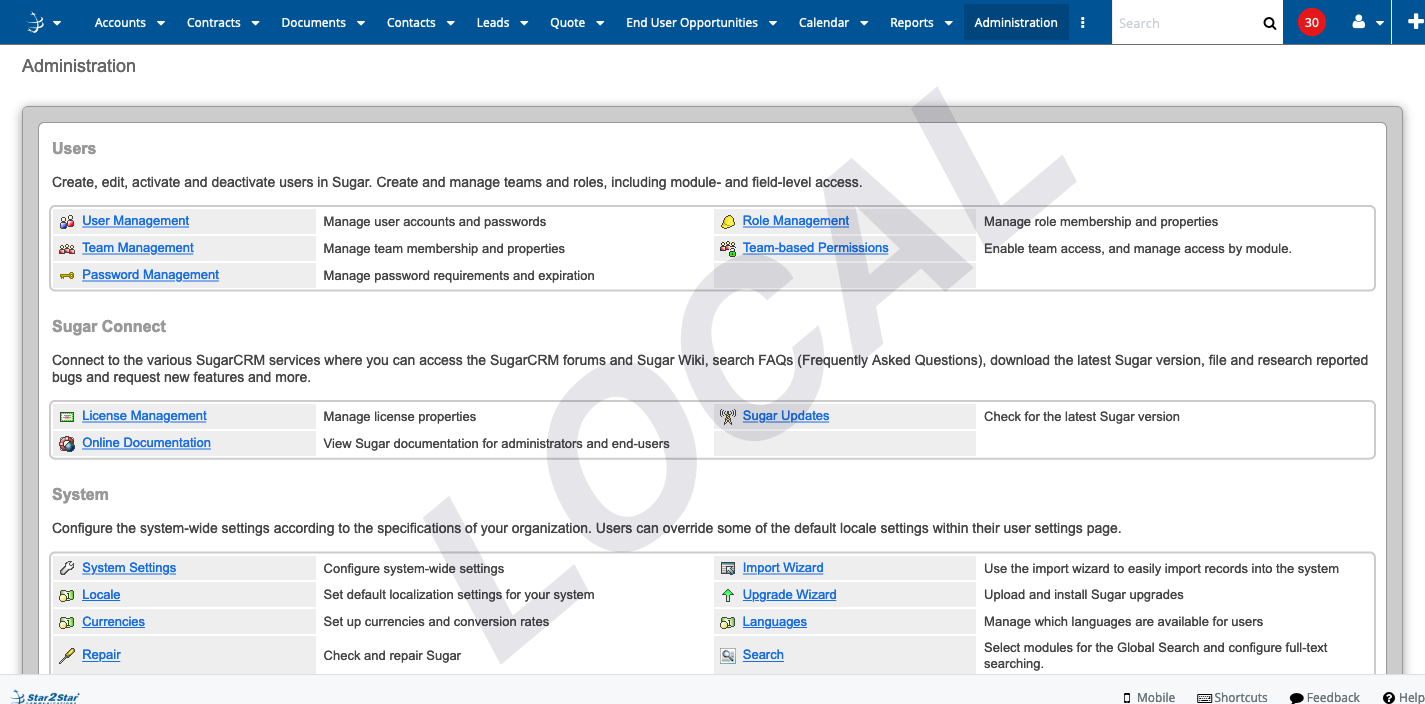
We have 4 different sets of servers on one of my SugarCRM Enterprise installs. We also have 4 people who do development, QA or Admin work so it is vitally important that everyone is aware of what server they are on. We all move among the servers all day and sometimes we forget which server we are on. We don't want a developer testing something or adding/deleting records in Production or a QA engineer to test something on a development server. I tried a few different options, mostly coloring the tabs and while this worked for a short while we found ourselves ignoring the colors after a week or two. I needed something that was more in your face. So I added a watermark to the code.
You cant ignore that. It is only seen by the 4 people in question and all other users see nothing. It appears on every page, custom modules, admin screen, everywhere. All I did was add a custom base.js file at custom/clients/base/layouts/base/base.js that looks like this
/*
 * Your installation or use of this SugarCRM file is subject to the applicable
 * terms available at
 * http://support.sugarcrm.com/Resources/Master_Subscription_Agreements/.
 * If you do not agree to all of the applicable terms or do not have the
 * authority to bind the entity as an authorized representative, then do not
 * install or use this SugarCRM file.
 *
 * Copyright (C) SugarCRM Inc. All rights reserved.
 */
/**
 * The Base Layout that all Layouts should extend from before extending
 * {@link #View.Layout}.
 *
 * Use this controller to specify your customizations for the Base platform.
 * This should contain any special override that only applies to Base platform
 * and not to Sidecar's library.
 *
 * Any Layout in a module can skip the default fallback and extend this one
 * directly. In your `BaseModuleMyLayout` component that lives in the file
 * `modules/<module>/clients/base/layouts/my-layout/my-layout.js`, you can
 * directly extend the `BaseLayout` skipping the normal extend flow which will
 * extend automatically from `BaseMyLayout` that might live in
 * `clients/base/layouts/my-layout/my-layout.js`. Simply define your controller
 * with:
 *
 * ```
 * ({
 *     extendsFrom: 'BaseLayout',
 *     // ...
 * })
 * ```
 *
 * This controller exists to force the component to be created and not fallback
 * to the default flow (which happens when the component isn't found).
 *
 * @class View.Layouts.Base.BaseLayout
 * @alias SUGAR.App.view.layouts.BaseBaseLayout
 * @extends View.Layout
 */
({
    /**
     * The Base Layout will always clear any tooltips after `render` or `dispose`.
     */
    initialize: function() {
        //watermark code 1.0
        //We have 4 users that need to see the watermark, we hide it for everyone else
        //  I might change this to use the department field on the user in the future but
        //  this works for now.
        let userID = app.user.id;
        if (userID === '20821fb3-541e-2d6e-1b89-56b8c6d65ce9' ||
            userID === 'b8f60911-ead1-31d9-1709-56cb52895212' ||
            userID === '0b069d40-2b7f-11e7-b49b-52d504b662cb' ||
            userID === '1cf7b3d3-73d0-73d9-9cbd-5527de354afc') {
            let url = window.location.href;
            //I test for the different URLs of the different machines.  If none are matched I assume
            // its a local copy on the users machine
            if (url.indexOf('production') !== -1) {
                $('head').append('<link rel="stylesheet" type="text/css" href="custom/themes/default/css/prod.css">');
            } else if (url.indexOf('qa') !== -1) {
                $('head').append('<link rel="stylesheet" type="text/css" href="custom/themes/default/css/dive.css">');
            } else if (url.indexOf('development') !== -1) {
                $('head').append('<link rel="stylesheet" type="text/css" href="custom/themes/default/css/dev.css">');
            } else {
                $('head').append('<link rel="stylesheet" type="text/css" href="custom/themes/default/css/local.css">');
            }
        }


        this._super('initialize', arguments);
        if (app.tooltip) {
            this.on('render', app.tooltip.clear);
        }
    }
})
This adds a CSS file from the custom/themes/default/css directory to the page depending on its URL. You would have to modify it to use your URL naming scheme. You would need to create 1 CSS file for each of your server types. The CSS it loads looks like this
custom/themes/default/css/local.css
html:after {
    /* common custom values */
    content: "LOCAL"; /* your site name */
    font-size: 225px; /* font size */
    color: rgba(0, 0, 50, .1);
    /* alpha, could be even rgba(0,0,0,.05) */

    /* rest of the logic */
    z-index: 9999;
    cursor: default;
    display: block;
    position: fixed;
    top: 33%;
    right: 0;
    bottom: 0;
    left: 15%;
    font-family: sans-serif;
    font-weight: bold;
    font-style: italic;
    text-align: center;
    line-height: 100%;

    /* not sure about who implemented what ..
      ... so bring it all */
    -webkit-pointer-events: none;
    -moz-pointer-events: none;
    -ms-pointer-events: none;
    -o-pointer-events: none;
    pointer-events: none;

    -webkit-transform: rotate(-40deg);
    -moz-transform: rotate(-40deg);
    -ms-transform: rotate(-40deg);
    -o-transform: rotate(-40deg);
    transform: rotate(-40deg);

    -webkit-user-select: none;
    -moz-user-select: none;
    -ms-user-select: none;
    -o-user-select: none;
    user-select: none;
}
And that's all there is to it. This seems like a tiny thing but it has been the second most useful customization I have yet made to our system.


-

John Hoffmann
-
Cancel
-
Vote Up
0
Vote Down
-
-
Sign in to reply
-
More Actions
-
Cancel
-

Kenneth Brill
in reply to John Hoffmann
-
Cancel
-
Vote Up
0
Vote Down
-
-
Sign in to reply
-
More Actions
-
Cancel
Comment-

Kenneth Brill
in reply to John Hoffmann
-
Cancel
-
Vote Up
0
Vote Down
-
-
Sign in to reply
-
More Actions
-
Cancel
Children