

Over the last few years, the introduction of Dark Mode has taken the mobile and web software community by storm. Aesthetically it has become the standard and, in some cases, the original and only appearance option in an application. Adding a secondary color scheme increases our accessibility since some users find a dark theme more readable and comfortable. It also creates a more cohesive experience for our users across all their applications or operating systems that already have Dark Mode support.
The latest versions of Sugar in SugarCloud (11.2.0) come with a refreshed UI, including Dark Mode support, aimed at creating a more consistent user and developer experience. Sugar will automatically adjust to use Dark Mode if your device is already set to that appearance preference. Each end user can manually control this setting by clicking the User Profile button in the top right corner, selecting Profile from the dropdown, and click Edit. Select the Advanced button and using the select field choose between: Use system setting, Light or Dark.
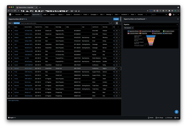
Let’s look at an example of what Dark Mode looks like on a list view.
Previously, Sugar had a fixed appearance that used mostly hard coded colors. Now that Dark Mode exists, we needed to update a lot of those colors. By improving our use of semantic colors, we made styling components easier, as each color variable name explains what it means and how it is used.
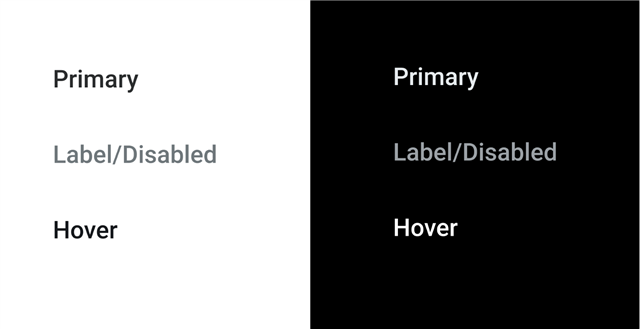
So, when we design UI, we choose the appropriate semantic colors for each component. You may be thinking, how do I design for Light and Dark Mode? That’s easy, you don’t have to. The great thing about our new color variables is that they are dynamic and have different values in Light and Dark Mode. Here are some example colors:
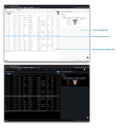
In addition to the standard palette, we’ve added complimentary secondary and tertiary colors that create a structured hierarchy within the UI. The goal here was to create a stack of colors that will work together and emphasize the importance of certain elements relative to others.
Customizations made for Sugar can vary, and we may not have provided every variable you require, but these updates should give you a good starting point. If you haven’t checked out the upcoming release preview, we recommend it to familiarize yourself with the design system and decide what you’d like to customize.
For example, text color may be used for titles and all primary text, whereas label color may be used for static text for fields and so on.
Creating CSS that supports light & dark modes
Using these colors is simple. Using widely supported CSS variables, no style pipeline or pre-processing libraries are required. If you have Sugar code downloaded, the palette is located at /sugarcrm/styleguide/assets/css/sugar-theme-variables.css. There are about 60 variables so we won’t list them all here. But we can show an example. Let’s look at the dashlet example from our developer documentation:
{{!--
/*
 * Your installation or use of this SugarCRM file is subject to the applicable
 * terms available at
 * http://support.sugarcrm.com/Resources/Master_Subscription_Agreements/.
 * If you do not agree to all of the applicable terms or do not have the
 * authority to bind the entity as an authorized representative, then do not
 * install or use this SugarCRM file.
 *
 * Copyright (C) SugarCRM Inc. All rights reserved.
 */
--}}
{{#if feed}}
    <div class="rss-feed">
        <h4>
            {{#if feed.link}}<a href="{{feed.link}}">{{/if}}
                {{feed.title}}
            {{#if feed.link}}</a>{{/if}}
        </h4>
        <ul>
            {{#each feed.entries}}
                <li class="news-article">
                    <a href="{{link}}">Dashlets</a>
                    {{#if author}} - {{str "LBL_RSS_FEED_AUTHOR"}} {{author}}{{/if}}
                </li>
            {{/each}}
        </ul>
    </div>
{{else}}
    <div class="block-footer">
        {{#if errorThrown}}
            {{str "LBL_NO_DATA_AVAILABLE"}}
        {{else}}
            {{loading 'LBL_ALERT_TITLE_LOADING'}}
        {{/if}}
    </div>
{{/if}}
Let’s say we wanted to modify the default Sugar styling that is used with this dashlet. A simple stylesheet for this, could look something like:
.rss-feed {
  background-color: var(--primary-background-color);
  border: 1px solid var(--border-color);
}

.rss-feed h4 {
  color: var(--text-color);
}

.block-footer {
  color: var(--text-color);
}
This custom styling will work in both Sugar’s dark and light modes, as is, without any modifications for a specific appearance preference.
It’s worth noting, that our Sugar blue palette, primary, dark and light color palettes stay the same for both light and dark modes.
The appearance in the UI is determined by a CSS class that is set on the top-level body element, either sugar-light-theme or sugar-dark-theme, which is automatically added on page load.
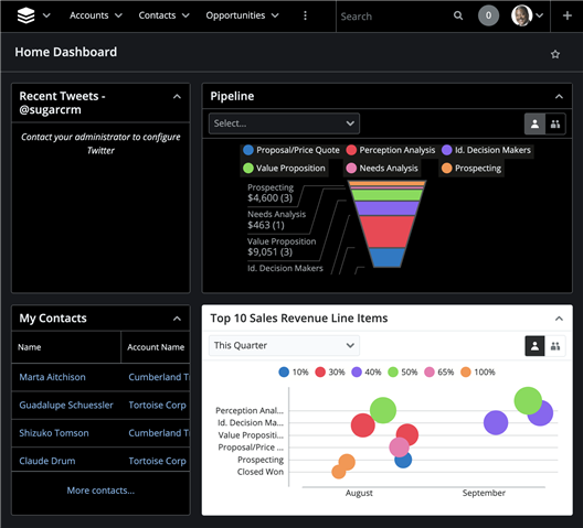
If necessary, you can use these classes to override the appearance of a specific component. This could be a useful “quick fix” if you have a custom UI that does not display properly in either light or dark mode. Here's an example, using the "Top 10" dashlet:
We do recommend that you work towards supporting both themes with any custom code that you write.
Test your custom UIs in light and dark mode
We recommend that you test any UI customizations to ensure it displays properly in both Light and Dark modes. It is easy enough to switch between modes by changing your operating system setting, your Sugar end-user setting, or toggling between sugar-light-theme and sugar-dark-theme classes in the developer tools console.
If you are using Sugar’s default stylesheets then you should not expect problems. But if you have custom CSS that use static colors then you may need to adjust them to use CSS variables similar to what we have done. As well, customizations made to the available theme variables have been affected and only have partial support at the moment:
PrimaryButtonworks for light/dark modesBorderColorworks for light mode onlyNavigationBaris overridden in both modes
If you are using images in your HTML then you may need to create alternative image files for light and dark modes in order to ensure they display properly with appropriate contrast!
For example, when we were developing Dark Mode we noticed that our black SugarCRM logo in the footer disappeared into the dark! We had to create and include a different logo image design for dark mode. And it’s now an additional System Setting for administrators so they can specify a different logos for light and dark mode.
-

Matthew Heinzel
-
Cancel
-
Vote Up
0
Vote Down
-
-
Sign in to reply
-
More Actions
-
Cancel
Comment-

Matthew Heinzel
-
Cancel
-
Vote Up
0
Vote Down
-
-
Sign in to reply
-
More Actions
-
Cancel
Children