

SugarCRM is on a mission to empower our users to delight their customers. To that end, we are pleased to introduce the first phase of visual restyling, and give some tips on how to work with the new UX.
Our process in developing the new UX
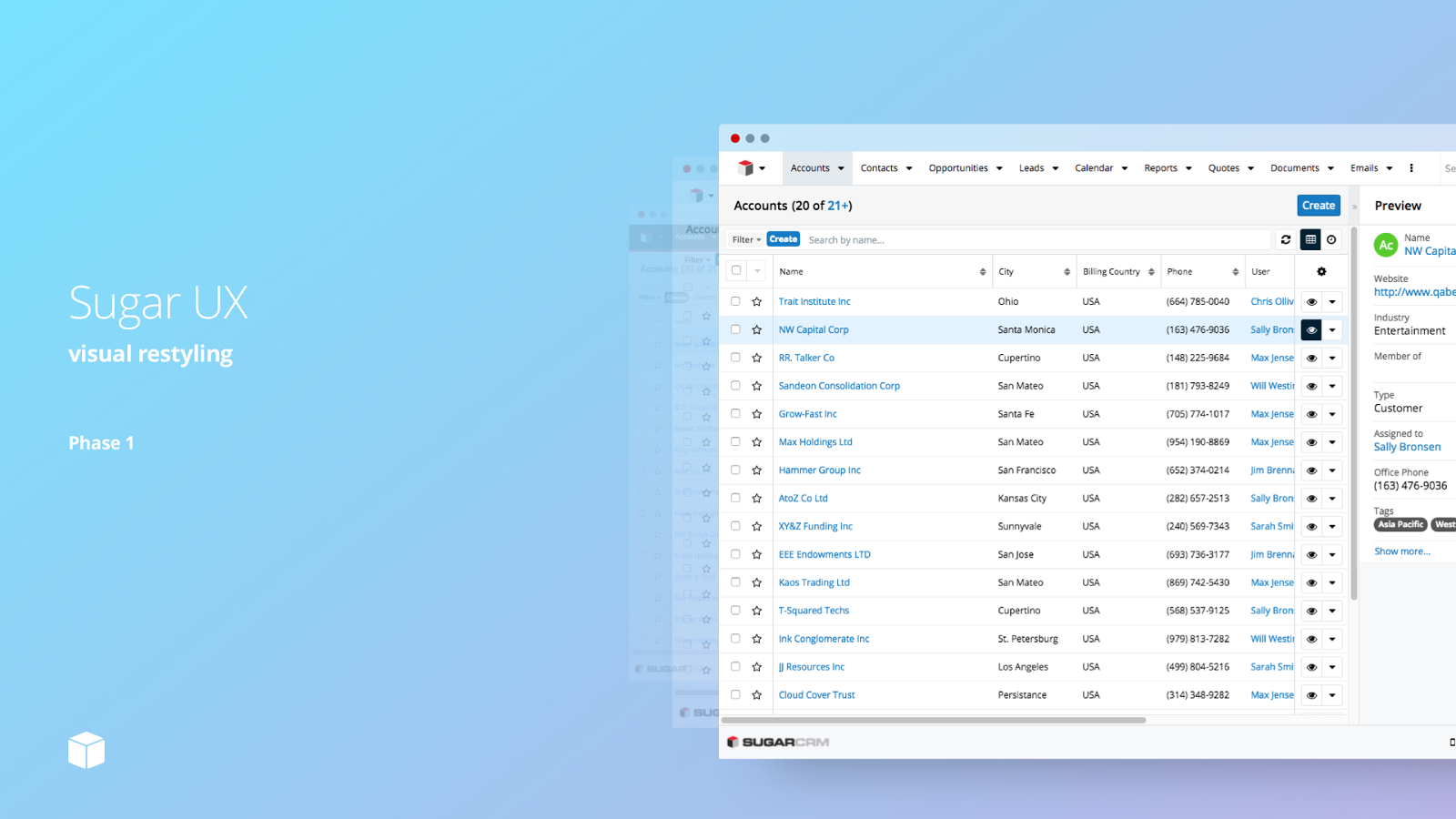
Sugar 7 introduced the Sidecar framework with massive user interface improvements (called SugarUX) and a modernized architecture. Since then, we have been working hard on the next iteration of SugarUX built on the Sidecar framework. Our guiding principles came from our customers and their feedback on Sidecar. A competitive analysis and feedback from customers revealed three concerns; cluttered complicated UX, inefficient unguided layout, and a drab outdated user interface.
The SugarCRM User Experience team (led by Brian Ng) launched a rigorous heuristic evaluation of the web and mobile Sugar products. Issues were identified as we evaluated key use cases and new solutions were documented. This thorough understanding of the product, customers, and the industry has helped us identify which issues to address first.
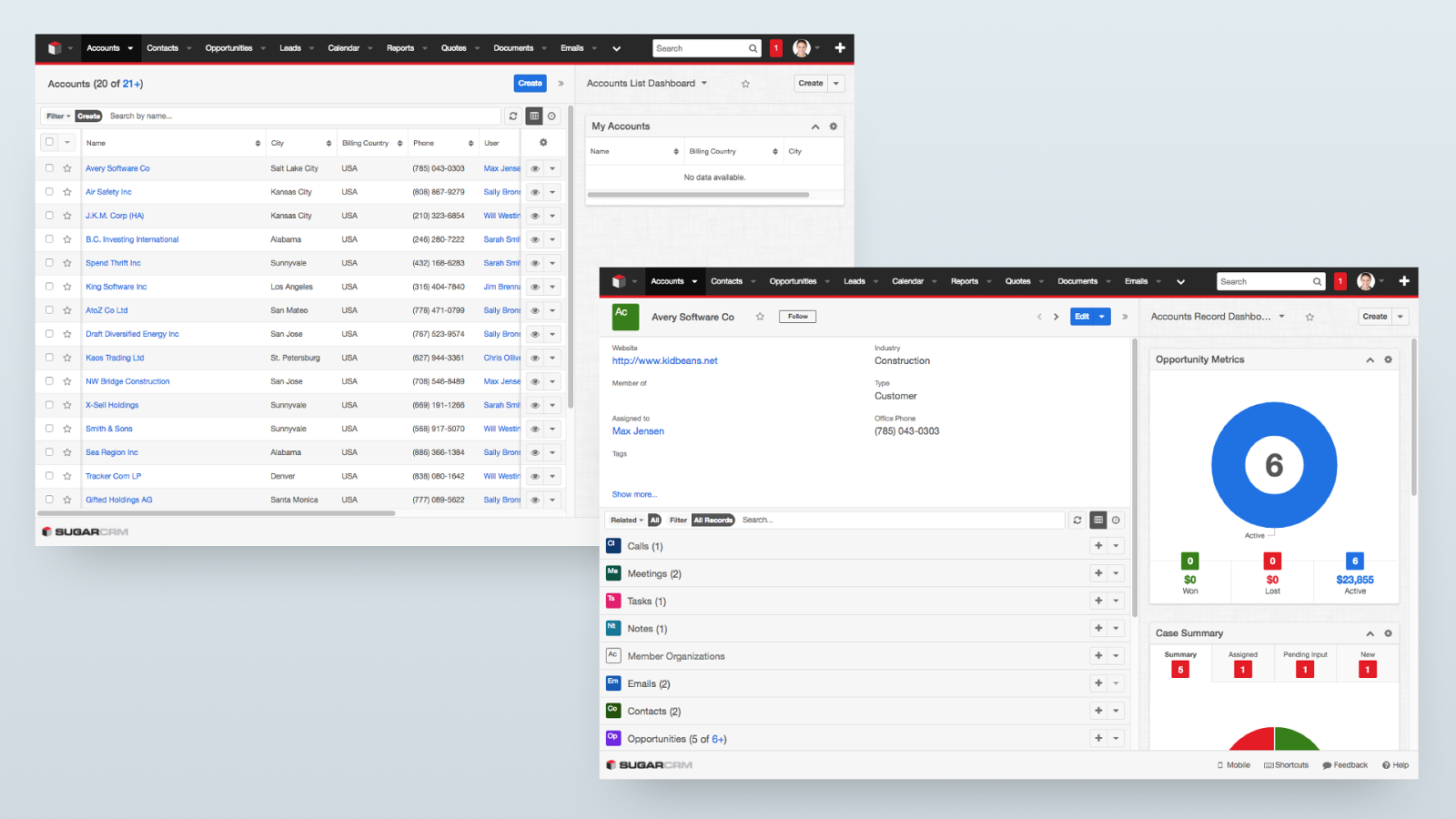
Dark gray text on light gray background led to poor legibility. Heavy blacks and gray linen added to the dated look and feel.
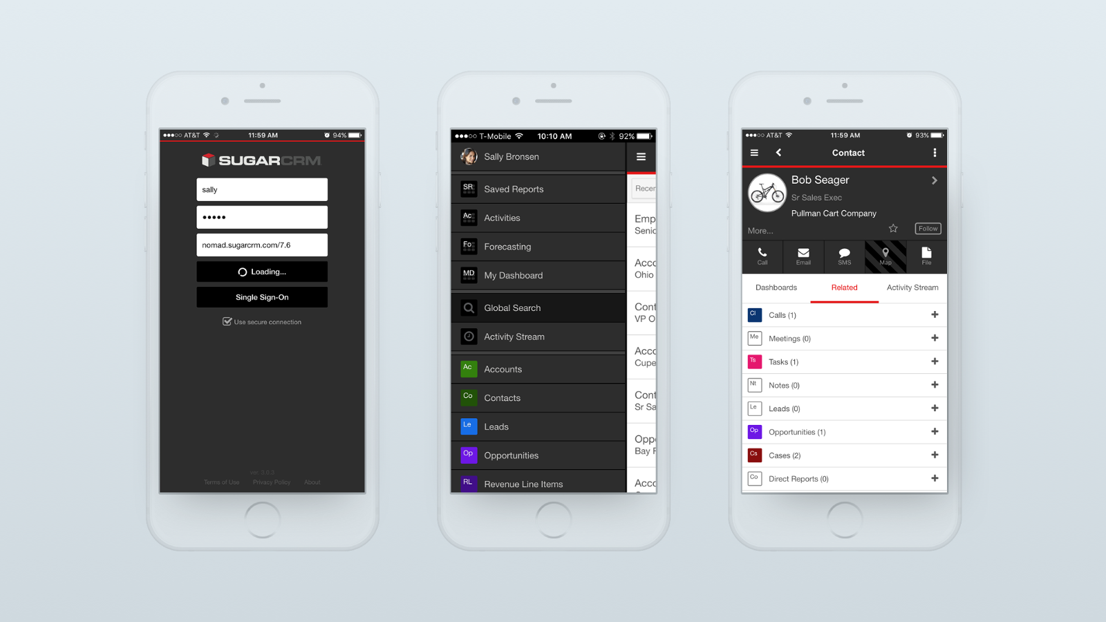
Sugar Mobile had a dark and drab visual design. Buttons for key actions were positioned differently on key screens.
Establishing Goals
With an understanding of the problems, we set goals for ourselves.
- Improve design for over 100 usability issues, prioritized by impact to the user's ability to get their job done.
- Establish a clean and modern visual design language, with rules documented in a style guide.
- Ensuring our products are accessible by all, meeting Web Content Accessibility Guidelines (WCAG) compliancy.
Guiding Principles for our new Design
We established three design principles: Clear, Consistent and Efficient. These principles guided all of our decision making. Establishing principles helped to resolve differences of opinions and to focus on user frustrations.We determined what colors and fonts would positively affect our use cases and still reflect our brand.
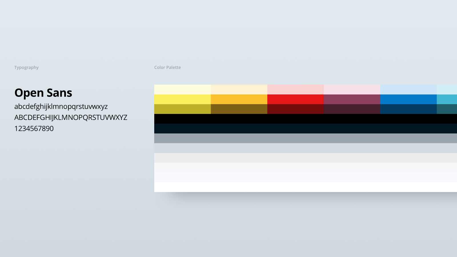
We have adopted Open Sans as the Sugar UX base font. It’s an open source font optimized for web and mobile interfaces with text heavy layouts. It’s known for its open, neutral type shape and friendly appearance. For colors, we have selected a color palette that is friendlier, modern and brighter.
We also selected a set of colors and fonts that would positively affect our use cases and still reflect the SugarCRM brand. Finally, we tested concepts in the real world, with real users in key flows to observe how they played out in practice.
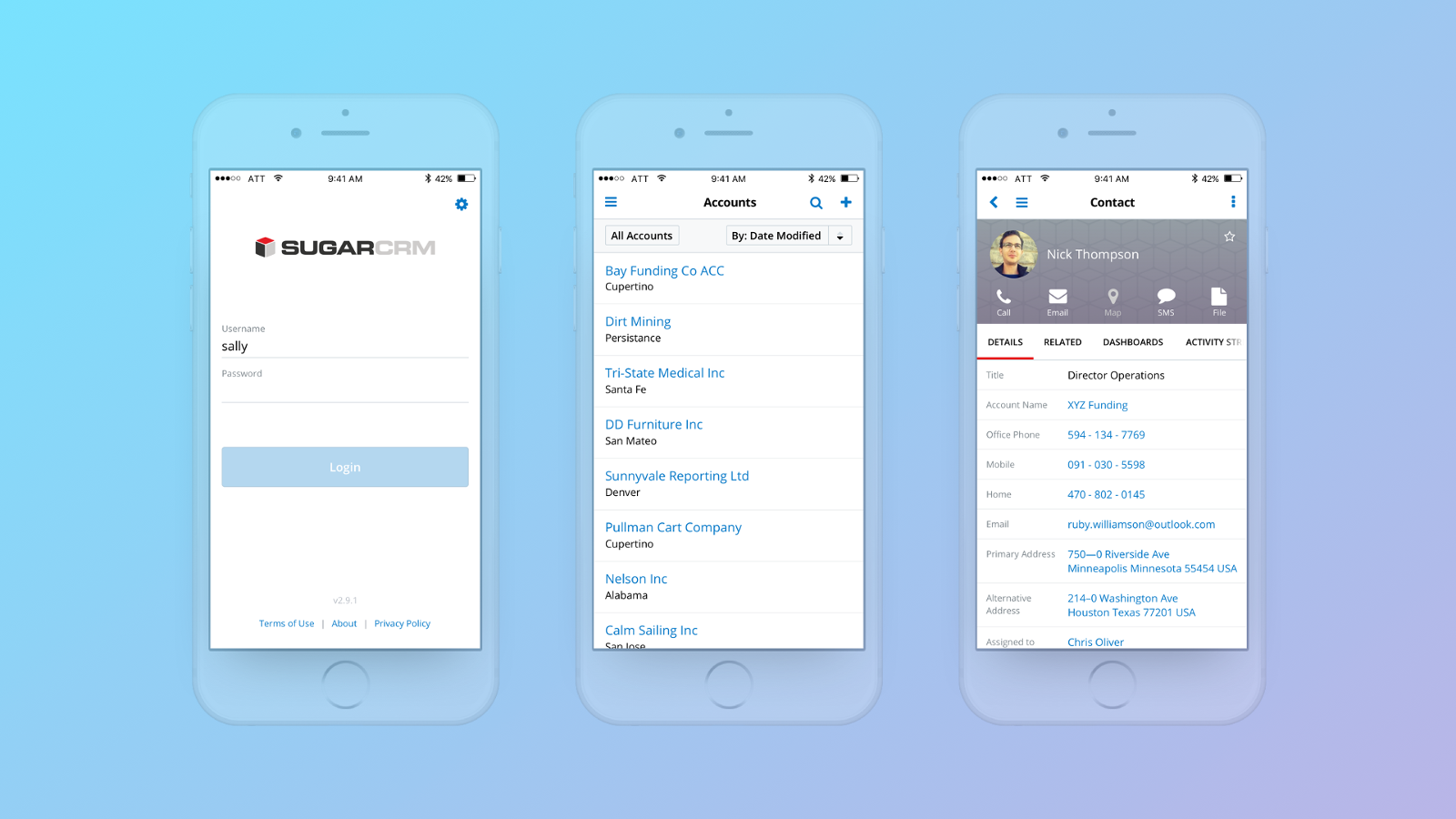
Mobile has a bright appearance and color placed in strategic locations to help users identify groups of information.
Results
- First revealed at SugarCon to over 1000 attendees where customers gave feedback.
- A new visual design language, documented in a Style Guide (coming soon), empowering customers and partners to implement SugarUX consistently on our product.
- Launch of the new SugarUX on our Sugar Mobile apps, available already on the the Apple App Store and Google Play.
Coming in Winter ‘18!
The first phase of our new UX is coming in Winter '18 release and we want to make sure the Sugar Developer community is first to give it a test drive. If you have built any Sidecar components or customizations (Dashlets, custom views or layouts, etc.) then you should verify that they display properly in new UX. As with all code level customizations, it is up to Sugar developers to make sure that you fix your code so that your customizations display properly in the new UX.
From implementation perspective, these changes have been made entirely in CSS where we've adjusted the styling for existing CSS classes. So, areas of concern would be in places where you have overridden the styling for Sugar's core CSS classes or have introduced your own CSS through the use of ./custom/themes/custom.less. The majority of customizations that simply use our existing CSS classes are expected to adopt new styling without errors.
As usual, we will be running an invitation only technical Preview program for the Winter '18 (On-Demand only) release. If you want to make sure that your organization is considered for this preview then please e-mail developers@sugarcrm.com and mention your interest in test driving the new Sugar UX!
Building your new Skin test plan
We have referred to this effort as the “new skin” because this first phase primarily involves changes to CSS and no significant changes to default HTML structure for any of our Sidecar Components.
How do you make sure your customizations are still pixel perfect? What follows below are some tips for you and your team to build a test plan.
Exploratory Testing
We recommend devoting a fixed amount of time to doing some exploratory testing in order to make sure your customizations look great in the new skin. How much time? It depends on how much UI you have. For example, it should not take you longer than a few minutes to test a custom Dashlet and uncover any bugs that you may want to address.
Guidelines for Testers
If you are testing, what are you looking for? Here are some tips.
- Customizations only. Testing should focus on customizations that your team created.
- CSS overrides. If you use a ./custom/themes/custom.less file or include your own CSS files, then you’ll need to pay special attention to these changes since they will likely need to be updated.
- Scrolling. Are you able to scroll and are there things that are inaccessible even with scrolling?
- Ellipsifying. When you shrink the window size down or reduce the available space for data on custom list views, record views, etc, do they ellipsify and show tooltips on hover?
- Responsiveness. Resizing the browser window or switching to and from responsive-mode. Observe what happens to elements on page.
- Orientation on tablets. Alternating display orientation between landscape and portrait modes.
- Toggle things. Open/close drawers, menus, edit and detail mode on record views, etc.
- Settings. Change system and profile settings that may alter how things look like date/time format, currency, etc.
Comparisons with out of the box Sugar
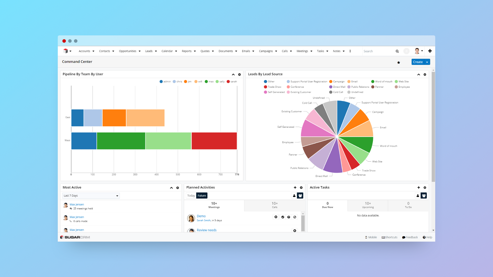
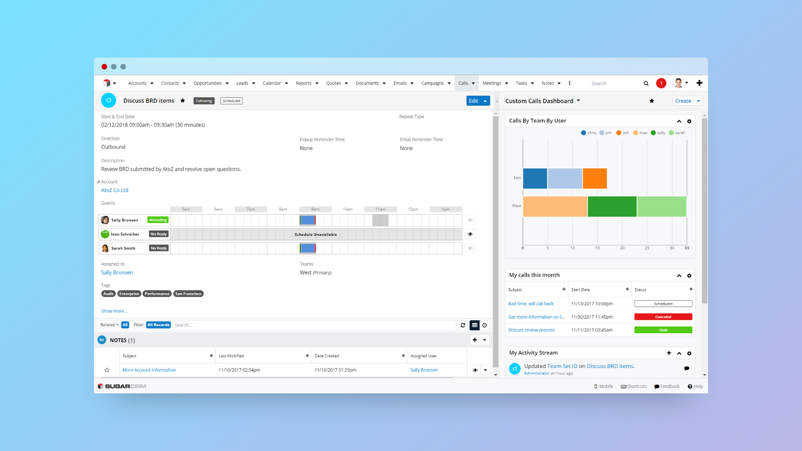
This post includes some example screenshots of what the new skin looks like out of the box. Comparing your customizations to the out of the box look and feel will help you identify things that you may need to change in your customizations. We encourage testers to keep two windows open while testing to compare the out of the box behavior in one window with your customizations in another window more easily.
-

Usman Saeed
-
Cancel
-
Vote Up
0
Vote Down
-
-
Sign in to reply
-
More Actions
-
Cancel
Comment-

Usman Saeed
-
Cancel
-
Vote Up
0
Vote Down
-
-
Sign in to reply
-
More Actions
-
Cancel
Children