Exciting Updates to Sugar’s User Interface in Q2 2020!

My name is Katherine Spencer, and I am Sugar’s Director of User Experience Design. Every one of Sugar’s quarterly releases includes a variety of enhancements to improve upon our customer experience platform and empower users with the best tools to do their jobs. My team and I are always working to facilitate this by providing the best user interface possible, helping companies effectively market, serve, and sell to customers. I am excited to highlight some of the User Interface (UI) updates that we are launching with the Q2 2020 release.

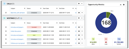
Data Density - There is plenty to look forward to in SugarCRM’s latest release. The first thing that you will probably notice is the compact new layout of our standard record view. By moving the labels to the left, and replacing empty data fields with pills, we can fit more information onto the screen as well as show you all of your empty data fields at quick glance. This will make it much easier to find and update empty data fields. I think that you are going to like the data density, but don’t worry if you don’t as you can move the labels back to the original location in your user preferences.

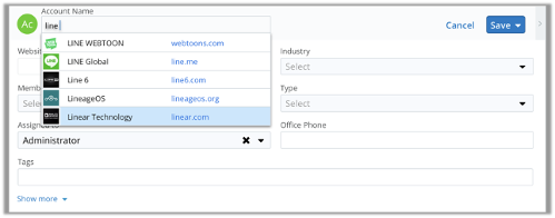
Type-ahead powered by Hint - Sugar Hint users are going to love this addition in the upcoming release. When you create a new account, simply start to type in the company name or website and the Hint data engine will provide you with a dropdown list of companies to select. You won’t even have to finish typing the full name.

Accessibility - Finally, you will notice that some of the colors have changed in this release. The User Experience design team at Sugar is constantly working to make our product more accessible for all users. Text is easier to read when there is good contrast between the foreground and background colors, so our new color choices improve color contrast, making fonts easier to read and meeting accessibility guidelines.

Our job on the user experience design team is to make your interactions with the Sugar family of products as easy and enjoyable as possible. We hope that this release makes your Sugar experience better, and we have more improvements planned!

Parents
  • I like the direction the UI is heading with trying to make things more compact but it definitely still needs some polish. As Groupe Sugar mentioned above, it is truncating a lot of our labels even though there is a ton of remaining space to the right of the fields.

    Also, we use lots of fields with visibility dependencies. In the new UI, when the fields are hidden, it just leaves white space where they were. In the old UI, if all the fields in the row were not visible, it would collapse the row and hide all the white space. With this new UI, we actually end up with way more white space than we used to. Kind of funny seems how these UI changes were made to make things more compact but in our case it is worse than before.

    UPDATE: There is a bug logged for the problem of dependent visible fields leaving blank space on the layout when they are not visible (defect 79052). The bug shows as closed and appears to be targeted for the next Sugar release. Until then, for people like me who can't wait that long for a fix, I was able to come up with on myself. The fix just involves adding some custom CSS rules. Posting the fix here in hopes it can help someone else with the same problem.

    In the ./custom/themes/custom.less file add the following CSS rules:

    .record .record-cell.vis_action_hidden>.detail
    {
        /* BEGIN fixes for labels on top */
        & > .normal
        {
            display: none !important;
        }
        /* END fixes for labels on top */
       
        /* BEGIN fixes for labels on side */
        & > .labels-on-side
        {
            & > .record-label-wrapper
            {
                margin-bottom: 0;
                min-height: 0;
               
                & > .record-label

                {
                    display: none !important;
                }
            }
           
            & > .record-link-wrapper
            {
                min-height: 0;
               
                & > .normal

                {
                    display: none !important;
                }
            }
        }
        /* END fixes for labels on side */
    }

    Do a quick repair/rebuild and you will also need to clear cached files in your browser to get the changes as the CSS files get cached by the browser. I kept the rules as specific as I can to minimize the chance of it getting applied to elements I didn't intend it to. When Sugar releases their fixes, will want to remove this fix in case it doesn't play nicely with Sugar's fix.

    Hope this helps others.

  • I agree and would add that a fully supported 3-column option would be really nice. We added that for one of our customers and the response was very positive. But we had a few random issues in the studio after that. So fully supporting 3-col would be anothe rstep forward!

  • Hello,

    Definitely, it's become important that you update the studio, including the 3 or 4 columns option, maybe the possibility to define the CSS class for an element (for instance to highlight a synchronized field),  maybe also additionnal columns in the field list view (searchable, calculated, dependent etc.) , a readonly option (that can be easily set in the vardef), the possibility to define the color to be use in the chart for dropdown values (and so the charts will be easier to compare) etc.

    I am sure there's a lot of things that can be done, maybe easily for some of them, to improve the admin experience.

    Fred

Comment
  • Hello,

    Definitely, it's become important that you update the studio, including the 3 or 4 columns option, maybe the possibility to define the CSS class for an element (for instance to highlight a synchronized field),  maybe also additionnal columns in the field list view (searchable, calculated, dependent etc.) , a readonly option (that can be easily set in the vardef), the possibility to define the color to be use in the chart for dropdown values (and so the charts will be easier to compare) etc.

    I am sure there's a lot of things that can be done, maybe easily for some of them, to improve the admin experience.

    Fred

Children
No Data